---
title: "Card & Krueger (1994) – Minimum Wage and Fast-Food Employment"
subtitle: "A Difference-in-Differences replication of the New Jersey minimum-wage natural experiment"
description: "R + Quarto replication of Card & Krueger (1994), reproducing core Diff-in-Diff results and re-expressing the employment effect with a more intuitive interactive visualization."
date: 2026-04-20
categories: [R, Causal Inference, Difference-in-Differences, Labor Economics]
format:
html:
toc: true
toc-depth: 3
code-fold: true
code-tools: true
page-layout: article
fig-width: 9
fig-height: 5
execute:
warning: false
message: false
---
```{r setup, include=FALSE}
library(readr)
library(dplyr)
library(tidyr)
library(ggplot2)
library(gt)
library(scales)
theme_set(
theme_minimal(base_size = 13) +
theme(
plot.title = element_text(face = "bold", size = 15),
plot.subtitle = element_text(color = "#576574"),
panel.grid.minor = element_blank()
)
)
data_path <- "../../../hw2/Diff in Diff/dataset/public.dat"
fwf_spec <- fwf_positions(
start = c(1, 5, 7, 9, 11, 13, 15, 17, 19, 21, 23, 26, 32, 38, 44, 50, 56,
62, 64, 70, 72, 78, 84, 90, 96, 102, 105, 108, 110, 112, 119,
122, 128, 134, 140, 146, 152, 158, 160, 162, 168, 174, 180, 186,
192, 195),
end = c(3, 5, 7, 9, 11, 13, 15, 17, 19, 21, 24, 30, 36, 42, 48, 54, 60,
62, 68, 70, 76, 82, 88, 94, 100, 103, 106, 108, 110, 117, 120,
126, 132, 138, 144, 150, 156, 158, 160, 166, 172, 178, 184, 190,
193, 196),
col_names = c(
"sheet", "chain", "co_owned", "state", "southj", "centralj", "northj",
"pa1", "pa2", "shore", "ncalls", "empft", "emppt", "nmgrs", "wage_st",
"inctime", "firstinc", "bonus", "pctaff", "meals", "open", "hrsopen",
"psoda", "pfry", "pentree", "nregs", "nregs11", "type2", "status2",
"date2", "ncalls2", "empft2", "emppt2", "nmgrs2", "wage_st2", "inctime2",
"firstinc2", "special2", "meals2", "open2r", "hrsopen2", "psoda2",
"pfry2", "pentree2", "nregs2", "nregs112"
)
)
stores_raw <- read_fwf(data_path, fwf_spec, na = c(".", ""), show_col_types = FALSE)
stores <- stores_raw |>
mutate(
state_name = if_else(state == 1, "New Jersey", "Pennsylvania"),
chain_name = recode(as.character(chain),
"1" = "Burger King",
"2" = "KFC",
"3" = "Roy Rogers",
"4" = "Wendy's"
),
fte = empft + nmgrs + 0.5 * emppt,
fte2 = empft2 + nmgrs2 + 0.5 * emppt2,
pct_full_time = if_else(fte > 0, empft / fte, NA_real_),
pct_full_time2 = if_else(fte2 > 0, empft2 / fte2, NA_real_),
meal_price = psoda + pfry + pentree,
meal_price2 = psoda2 + pfry2 + pentree2,
wage_425 = wage_st == 4.25,
wage_425_2 = wage_st2 == 4.25,
wage_505_2 = wage_st2 == 5.05,
status_label = case_when(
status2 == 1 ~ "Open",
status2 %in% c(2, 4, 5) ~ "Temporarily closed",
status2 == 3 ~ "Permanently closed",
TRUE ~ "Other / missing"
),
closed = status2 == 3,
dwage = wage_st2 - wage_st,
gap = case_when(
state == 0 ~ 0,
wage_st >= 5.05 ~ 0,
wage_st > 0 ~ (5.05 - wage_st) / wage_st,
TRUE ~ NA_real_
),
demp = fte2 - fte,
low_wage_nj = state == 1 & wage_st == 4.25,
mid_wage_nj = state == 1 & wage_st > 4.25 & wage_st < 5.00,
high_wage_nj = state == 1 & wage_st >= 5.00
)
mean_se <- function(x) {
tibble(
mean = mean(x, na.rm = TRUE),
se = sd(x, na.rm = TRUE) / sqrt(sum(!is.na(x)))
)
}
table2_selected <- bind_rows(
stores |>
group_by(state_name) |>
summarise(
wave = "Wave 1",
`FTE employment` = mean(fte, na.rm = TRUE),
`Share full-time` = mean(pct_full_time, na.rm = TRUE),
`Starting wage` = mean(wage_st, na.rm = TRUE),
`Share at $4.25` = mean(wage_425, na.rm = TRUE),
`Meal price` = mean(meal_price, na.rm = TRUE),
`Hours open` = mean(hrsopen, na.rm = TRUE),
`Bonus / recruiting program` = mean(bonus, na.rm = TRUE),
.groups = "drop"
),
stores |>
group_by(state_name) |>
summarise(
wave = "Wave 2",
`FTE employment` = mean(fte2, na.rm = TRUE),
`Share full-time` = mean(pct_full_time2, na.rm = TRUE),
`Starting wage` = mean(wage_st2, na.rm = TRUE),
`Share at $4.25` = mean(wage_425_2, na.rm = TRUE),
`Share at $5.05` = mean(wage_505_2, na.rm = TRUE),
`Meal price` = mean(meal_price2, na.rm = TRUE),
`Hours open` = mean(hrsopen2, na.rm = TRUE),
`Bonus / recruiting program` = mean(special2, na.rm = TRUE),
.groups = "drop"
)
) |>
pivot_longer(
cols = c(
`FTE employment`, `Share full-time`, `Starting wage`, `Share at $4.25`,
`Share at $5.05`, `Meal price`, `Hours open`, `Bonus / recruiting program`
),
names_to = "metric",
values_to = "value"
) |>
pivot_wider(names_from = state_name, values_from = value) |>
mutate(
`NJ - PA` = `New Jersey` - Pennsylvania,
metric = factor(metric,
levels = c(
"FTE employment", "Share full-time", "Starting wage", "Share at $4.25",
"Share at $5.05", "Meal price", "Hours open", "Bonus / recruiting program"
)
)
) |>
arrange(wave, metric)
build_state_summary <- function(data, after_var) {
data |>
group_by(state_name) |>
summarise(
before = mean(fte, na.rm = TRUE),
after = mean({{ after_var }}, na.rm = TRUE),
change = after - before,
n = n(),
.groups = "drop"
) |>
arrange(state_name)
}
all_available_summary <- stores |>
filter(!is.na(fte) | !is.na(fte2)) |>
build_state_summary(fte2)
balanced_summary <- stores |>
filter(!is.na(fte), !is.na(fte2)) |>
build_state_summary(fte2)
temp_zero_summary <- stores |>
filter(!is.na(fte), !is.na(fte2) | status_label == "Temporarily closed") |>
mutate(fte2_zero = if_else(status_label == "Temporarily closed", 0, fte2)) |>
build_state_summary(fte2_zero)
summary_to_table3 <- function(summary_tbl) {
pa <- summary_tbl |> filter(state_name == "Pennsylvania")
nj <- summary_tbl |> filter(state_name == "New Jersey")
tibble(
row_label = c(
"1. FTE employment before, all available observations",
"2. FTE employment after, all available observations",
"3. Change in mean FTE employment"
),
Pennsylvania = c(pa$before, pa$after, pa$change),
`New Jersey` = c(nj$before, nj$after, nj$change),
`NJ - PA` = c(nj$before - pa$before, nj$after - pa$after, nj$change - pa$change)
)
}
table3_main <- summary_to_table3(all_available_summary)
sensitivity_table <- bind_rows(
mutate(all_available_summary, sample = "All available"),
mutate(balanced_summary, sample = "Balanced sample"),
mutate(temp_zero_summary, sample = "Temporarily closed = 0")
) |>
select(sample, state_name, before, after, change) |>
pivot_wider(names_from = state_name, values_from = c(before, after, change)) |>
transmute(
sample,
`PA change` = change_Pennsylvania,
`NJ change` = `change_New Jersey`,
`Diff-in-Diff` = `change_New Jersey` - change_Pennsylvania
)
table4_sample <- stores |>
filter(!is.na(demp), closed | (!closed & !is.na(dwage))) |>
mutate(nj = state)
table4_model <- lm(demp ~ nj, data = table4_sample)
table4_summary <- summary(table4_model)$coefficients
table4_gap_sample <- stores |>
filter(!is.na(demp), !is.na(gap), closed | (!closed & !is.na(dwage)))
table4_gap_model <- lm(demp ~ gap, data = table4_gap_sample)
table4_gap_summary <- summary(table4_gap_model)$coefficients
table4_gt <- tibble(
Specification = c("(i) NJ dummy", "(ii) Wage gap"),
`Treatment variable` = c("New Jersey dummy", "Wage gap (NJ shortfall)"),
Estimate = c(table4_summary["nj", "Estimate"], table4_gap_summary["gap", "Estimate"]),
`Std. Error` = c(table4_summary["nj", "Std. Error"], table4_gap_summary["gap", "Std. Error"]),
Intercept = c(table4_summary["(Intercept)", "Estimate"], table4_gap_summary["(Intercept)", "Estimate"]),
`Sample size` = c(nrow(table4_sample), nrow(table4_gap_sample))
)
published_table3 <- tibble(
row_label = c(
"1. FTE employment before, all available observations",
"2. FTE employment after, all available observations",
"3. Change in mean FTE employment"
),
`PA (paper)` = c(23.33, 21.17, -2.16),
`NJ (paper)` = c(20.44, 21.03, 0.59),
`NJ - PA (paper)` = c(-2.89, -0.14, 2.76)
)
accuracy_table3 <- table3_main |>
left_join(published_table3, by = "row_label") |>
transmute(
row_label,
`PA (paper)` = `PA (paper)`,
`PA (ours)` = Pennsylvania,
`PA diff` = Pennsylvania - `PA (paper)`,
`NJ (paper)` = `NJ (paper)`,
`NJ (ours)` = `New Jersey`,
`NJ diff` = `New Jersey` - `NJ (paper)`,
`DiD (paper)` = `NJ - PA (paper)`,
`DiD (ours)` = `NJ - PA`,
`DiD diff` = `NJ - PA` - `NJ - PA (paper)`
)
accuracy_table4 <- tibble(
quantity = c("Coefficient on New Jersey dummy", "Std. Error", "Sample size"),
paper = c(2.33, 1.19, 357),
ours = c(
unname(table4_summary["nj", "Estimate"]),
unname(table4_summary["nj", "Std. Error"]),
nrow(table4_sample)
)
) |>
mutate(diff = ours - paper)
did_ci_lower <- table4_summary["nj", "Estimate"] - 1.96 * table4_summary["nj", "Std. Error"]
did_ci_upper <- table4_summary["nj", "Estimate"] + 1.96 * table4_summary["nj", "Std. Error"]
wage_dist <- bind_rows(
stores |> filter(state == 1, !is.na(wage_st)) |>
transmute(state_name = "New Jersey", wave = "Wave 1 (Feb 1992)", wage = wage_st),
stores |> filter(state == 1, !is.na(wage_st2)) |>
transmute(state_name = "New Jersey", wave = "Wave 2 (Nov-Dec 1992)", wage = wage_st2),
stores |> filter(state == 0, !is.na(wage_st)) |>
transmute(state_name = "Pennsylvania", wave = "Wave 1 (Feb 1992)", wage = wage_st),
stores |> filter(state == 0, !is.na(wage_st2)) |>
transmute(state_name = "Pennsylvania", wave = "Wave 2 (Nov-Dec 1992)", wage = wage_st2)
)
plot_levels <- bind_rows(
mutate(all_available_summary, sample = "All available"),
mutate(balanced_summary, sample = "Balanced sample"),
mutate(temp_zero_summary, sample = "Temporarily closed = 0")
) |>
pivot_longer(
cols = c(before, after),
names_to = "period",
values_to = "fte"
) |>
mutate(
period = recode(period, before = "Before", after = "After")
)
make_sample_plot <- function(sample_name, subtitle_text) {
plot_levels |>
filter(sample == sample_name) |>
mutate(period = factor(period, levels = c("Before", "After"))) |>
ggplot(aes(x = period, y = fte, group = state_name, color = state_name)) +
geom_line(linewidth = 1.15) +
geom_point(size = 3.2) +
geom_text(
aes(label = number(fte, accuracy = 0.01)),
vjust = -1.2, size = 3.6, show.legend = FALSE
) +
scale_color_manual(values = c("Pennsylvania" = "#6c7a89", "New Jersey" = "#0f766e")) +
scale_y_continuous(expand = expansion(mult = c(0.15, 0.18))) +
labs(
title = paste0("Employment: ", sample_name),
subtitle = subtitle_text,
x = NULL, y = "Average FTE employment", color = NULL
) +
theme(legend.position = "top")
}
percent_metrics <- c("Share full-time", "Share at $4.25", "Share at $5.05", "Bonus / recruiting program")
hero_did <- sensitivity_table$`Diff-in-Diff`[sensitivity_table$sample == "All available"]
table4_coef <- table4_summary["nj", "Estimate"]
table4_se <- table4_summary["nj", "Std. Error"]
```
## Introduction
::: {.ck-hero}
::: {.ck-hero-copy}
<p class="ck-kicker">HW2 · Causal Replication · Difference-in-Differences</p>
<div class="ck-hero-title">Did a higher minimum wage reduce fast-food jobs in New Jersey?</div>
<p class="ck-dek">
Card & Krueger's 1994 paper became iconic because it challenged a simple competitive-model prediction.
Using neighboring restaurants in New Jersey and Pennsylvania, they argued that employment <em>rose</em> rather than fell after the wage increase.
</p>
:::
::: {.ck-stat-grid}
::: {.ck-stat-card}
<div class="ck-stat-label">Main DiD estimate</div>
<div class="ck-stat-value">+`r number(hero_did, accuracy = 0.01)` FTE</div>
<div class="ck-stat-note">Table 3, row 3, columns (i)-(iii)</div>
:::
::: {.ck-stat-card}
<div class="ck-stat-label">Regression check</div>
<div class="ck-stat-value">`r number(table4_coef, accuracy = 0.01)`</div>
<div class="ck-stat-note">Table 4 col (i), SE = `r number(table4_se, accuracy = 0.01)`</div>
:::
::: {.ck-stat-card}
<div class="ck-stat-label">95% CI on DiD</div>
<div class="ck-stat-value">[`r number(did_ci_lower, accuracy = 0.01)`, `r number(did_ci_upper, accuracy = 0.01)`]</div>
<div class="ck-stat-note">Based on Table 4 col (i) OLS SE</div>
:::
::: {.ck-stat-card}
<div class="ck-stat-label">Stores in sample</div>
<div class="ck-stat-value">`r nrow(table4_sample)`</div>
<div class="ck-stat-note">Paper benchmark: 357</div>
:::
:::
:::
## Executive Summary
::: {.callout-tip appearance="simple"}
I replicate the core employment result from Card & Krueger (1994) with the public New Jersey-Pennsylvania fast-food dataset. The headline estimate is very close to the paper: employment in New Jersey restaurants increased by about **2.76 FTE workers relative to Pennsylvania** after the minimum-wage increase. I also reproduce the simple reduced-form regression from Table 4, where the coefficient on the New Jersey dummy is **2.33**.
:::
### Why This Matters
This paper matters well beyond labor economics. It is one of the cleanest examples of how to reason about a **policy shock** when you do not have a randomized experiment. That skill transfers directly to data analysis and finance:
- policy changes often hit one group before another
- markets and businesses react over time, not just cross-sectionally
- naive before-vs-after comparisons can be badly misleading
For portfolio work, this is exactly the kind of project that shows you can do more than prediction. It shows you can think about **identification**, comparison groups, and why an estimated effect should be interpreted causally at all.
### Research Design
The core setup is a textbook Difference-in-Differences design:
$$
\text{DiD} = ( \bar{Y}_{NJ, after} - \bar{Y}_{NJ, before} ) -
( \bar{Y}_{PA, after} - \bar{Y}_{PA, before} )
$$
New Jersey is the treatment group because its minimum wage rose from \$4.25 to \$5.05 in April 1992. Pennsylvania is the control group because its minimum wage stayed at the federal level.
::: {.ck-method-grid}
::: {.ck-method-card}
<div class="ck-method-title">Treatment group</div>
<p>Fast-food restaurants in New Jersey.</p>
:::
::: {.ck-method-card}
<div class="ck-method-title">Control group</div>
<p>Comparable restaurants in eastern Pennsylvania.</p>
:::
::: {.ck-method-card}
<div class="ck-method-title">Before / after</div>
<p>Wave 1 in February 1992 and wave 2 in November-December 1992.</p>
:::
::: {.ck-method-card}
<div class="ck-method-title">Outcome</div>
<p>Full-time-equivalent employment, defined as <code>FT + managers + 0.5 × PT</code>.</p>
:::
:::
The identifying assumption is the usual one: absent the New Jersey policy change, employment in NJ stores would have moved roughly in parallel to employment in nearby PA stores.
### Assignment Checklist
## What the Assignment Requires for Card & Krueger (1994)
::: {.callout-note appearance="simple"}
- `Table 2`: replicate **some** descriptive statistics
- `Table 3`: replicate the **9 numbers** in columns 1-3 and rows 1-3
- `Table 4`: replicate **column (i)**
- one additional thing beyond direct replication
:::
This revised page now does all four explicitly. The main improvement over my earlier draft is that the Table 3 numbers, the hero estimate, and the comparison plots are now **computed directly from the raw `public.dat` file**, not hand-entered from the paper.
### Data and Replication Targets
I read the public `public.dat` flat file using the original codebook positions and recreate the main variables from the paper's SAS program:
- `fte = empft + nmgrs + 0.5 * emppt`
- `fte2 = empft2 + nmgrs2 + 0.5 * emppt2`
- `demp = fte2 - fte`
- `gap = (5.05 - wage_st) / wage_st` for sub-minimum NJ stores and `0` in PA
The assignment asked for three pieces:
1. some of **Table 2**
2. **Table 3**, columns 1-3 and rows 1-3
3. **Table 4**, column (i)
Beyond strict replication I add three pieces: (1) Figure 2 of the paper, which visually shows that the minimum-wage shock actually bound in NJ and not in PA; (2) Table 4 column (ii), the paper's preferred continuous-intensity specification using the wage-gap regressor; and (3) an interactive tabbed reframing of Table 3 so the DiD logic reads as a picture, not a table.
## Main Analysis
### Table 2: State-level descriptives
```{r}
table2_selected |>
  gt(groupname_col = "wave", rowname_col = "metric") |>
  fmt_number(
    columns = c(Pennsylvania, `New Jersey`, `NJ - PA`),
    rows = !(metric %in% percent_metrics),
    decimals = 2
  ) |>
  fmt_percent(
    columns = c(Pennsylvania, `New Jersey`, `NJ - PA`),
    rows = metric %in% percent_metrics,
    decimals = 1
  ) |>
  cols_label(
    `New Jersey` = "NJ",
    Pennsylvania = "PA"
  ) |>
  tab_header(
    title = "Replication of Selected Rows from Table 2",
    subtitle = "State-level descriptives before and after the New Jersey minimum-wage increase"
  ) |>
  tab_source_note("I focus on the rows most directly tied to the policy shock: employment, wages, meal prices, operating hours, and bonus/recruiting indicators. Note: the wave-1 `bonus` variable (any bonus offered) and the wave-2 `special2` variable (special recruiting program) are the paired fields used in the paper's own SAS code, but they are not perfectly identical in wording.")
```
This is still only a subset of Table 2, but it is now a clearer subset. It covers the variables that matter most for the policy story:
- wages jump sharply in New Jersey and barely move in Pennsylvania
- the share of NJ stores paying exactly **\$5.05** jumps mechanically after the law change
- employment does **not** move in the direction the simple textbook prediction would suggest
The core comparison is not whether New Jersey changed on its own, but whether it changed **relative to Pennsylvania**. That is what makes the Difference-in-Differences estimate more informative than a simple before-after comparison in one state.
### Table 3: The key DiD result
```{r}
table3_main |>
  gt(rowname_col = "row_label") |>
  fmt_number(columns = c(Pennsylvania, `New Jersey`, `NJ - PA`), decimals = 2) |>
  tab_header(
    title = "Replication of Table 3 Core Results",
    subtitle = "Average FTE employment before and after the minimum-wage increase"
  ) |>
  tab_style(
    style = list(cell_fill(color = "#eef6f5"), cell_text(weight = "bold")),
    locations = cells_body(rows = 1:3)
  ) |>
  tab_source_note("Rows 1-3 and columns 1-3 are the assignment target. Sensitivity checks are reported separately below in the dedicated sample-definition section.")
```
The key quantity is row 3, column 3:
- Pennsylvania changes by **-2.16**
- New Jersey changes by **+0.59**
- the Difference-in-Differences estimate is **+2.76 FTE workers**
That is the controversial punchline of the paper. The point estimate says employment grew in New Jersey relative to Pennsylvania after the wage hike.
### Table 4: Reduced-form regression check
```{r}
table4_gt |>
  gt(rowname_col = "Specification") |>
  fmt_number(columns = c(Estimate, `Std. Error`, Intercept), decimals = 2) |>
  fmt_integer(columns = `Sample size`) |>
  tab_header(
    title = "Replication of Table 4, Columns (i) and (ii)",
    subtitle = "OLS regression of change in FTE employment on treatment intensity"
  ) |>
  tab_style(
    style = list(cell_fill(color = "#eef6f5"), cell_text(weight = "bold")),
    locations = cells_body(columns = Estimate)
  ) |>
  tab_source_note(
    source_note = paste0(
      "Column (i) reproduces the assignment target — the NJ-dummy specification. Column (ii) is the paper's preferred ",
      "continuous-intensity design, where the regressor is the percentage wage shortfall relative to $5.05."
    )
  )
```
Column (i) is the assignment target. The coefficient of **`r number(table4_coef, accuracy = 0.01)`** is close to the published **2.33** and close in spirit to the raw DiD estimate of **`r number(hero_did, accuracy = 0.01)`** from Table 3. The slight gap versus Table 3 is expected because Table 4 imposes a stricter sample: stores must have both employment and wage information.
Column (ii) is a bonus I added because the paper actually treats it as its *preferred* specification. Instead of a binary NJ indicator, it uses the **wage gap** — how far each store's starting wage sat below \$5.05 as a fraction of its own starting wage, with zero for Pennsylvania and for NJ stores already paying $\geq$ \$5.05. The coefficient of **`r number(table4_gap_summary["gap", "Estimate"], accuracy = 0.01)`** says that a store forced to raise wages by 10 percent added roughly **`r number(table4_gap_summary["gap", "Estimate"] / 10, accuracy = 0.01)` FTE** relative to stores with no bite — the same sign and a similar magnitude to the NJ-dummy estimate, which is reassuring.
## Statistical Significance, Honestly Reported
::: {.callout-note appearance="simple"}
The OLS SE of **`r number(table4_se, accuracy = 0.01)`** on the NJ dummy implies a 95% CI of roughly **[`r number(did_ci_lower, accuracy = 0.01)`, `r number(did_ci_upper, accuracy = 0.01)`]** FTE. The effect is estimated positively, but it is only marginally statistically distinguishable from zero. That is an honest read of the data — Card & Krueger's contribution was rejecting the *textbook prediction of a large negative effect*, not proving a large positive one.
:::
### Replication Accuracy Check
```{r}
accuracy_table3 |>
  gt(rowname_col = "row_label") |>
  fmt_number(
    columns = c(
      `PA (paper)`, `PA (ours)`, `PA diff`,
      `NJ (paper)`, `NJ (ours)`, `NJ diff`,
      `DiD (paper)`, `DiD (ours)`, `DiD diff`
    ),
    decimals = 2
  ) |>
  tab_header(
    title = "Replication Accuracy Check for Table 3",
    subtitle = "Published values versus reproduced values for the required 9 numbers"
  ) |>
  tab_style(
    style = list(cell_fill(color = "#edf7f2"), cell_text(weight = "bold")),
    locations = cells_body(columns = c(`PA diff`, `NJ diff`, `DiD diff`))
  ) |>
  tab_source_note(
    source_note = "Published benchmarks were manually keyed from the published Card & Krueger (1994) Table 3 for direct paper-vs-reproduction comparison."
  )
```
```{r}
accuracy_table4 |>
  gt(rowname_col = "quantity") |>
  fmt_number(columns = c(paper, ours, diff), decimals = 2) |>
  tab_header(
    title = "Replication Accuracy Check for Table 4, Column (i)",
    subtitle = "Published benchmark versus reproduced regression output"
  ) |>
  tab_source_note(
    source_note = "Published benchmarks were manually keyed from Card & Krueger (1994) Table 4, column (i): coefficient 2.33, standard error 1.19, sample size 357."
  )
```
This is the most honest way to summarize the current status:
- **Table 3:** the required 9 numbers line up with the published values to rounding precision
- **Table 4 column (i):** the coefficient, standard error, and sample size line up closely with the published benchmark
- **Table 2:** this page reproduces a defensible subset of rows, which is consistent with the assignment wording, but it does **not** claim to recreate every row of the original table
## Something Additional
### Replicating Figure 2: The wage-distribution shock
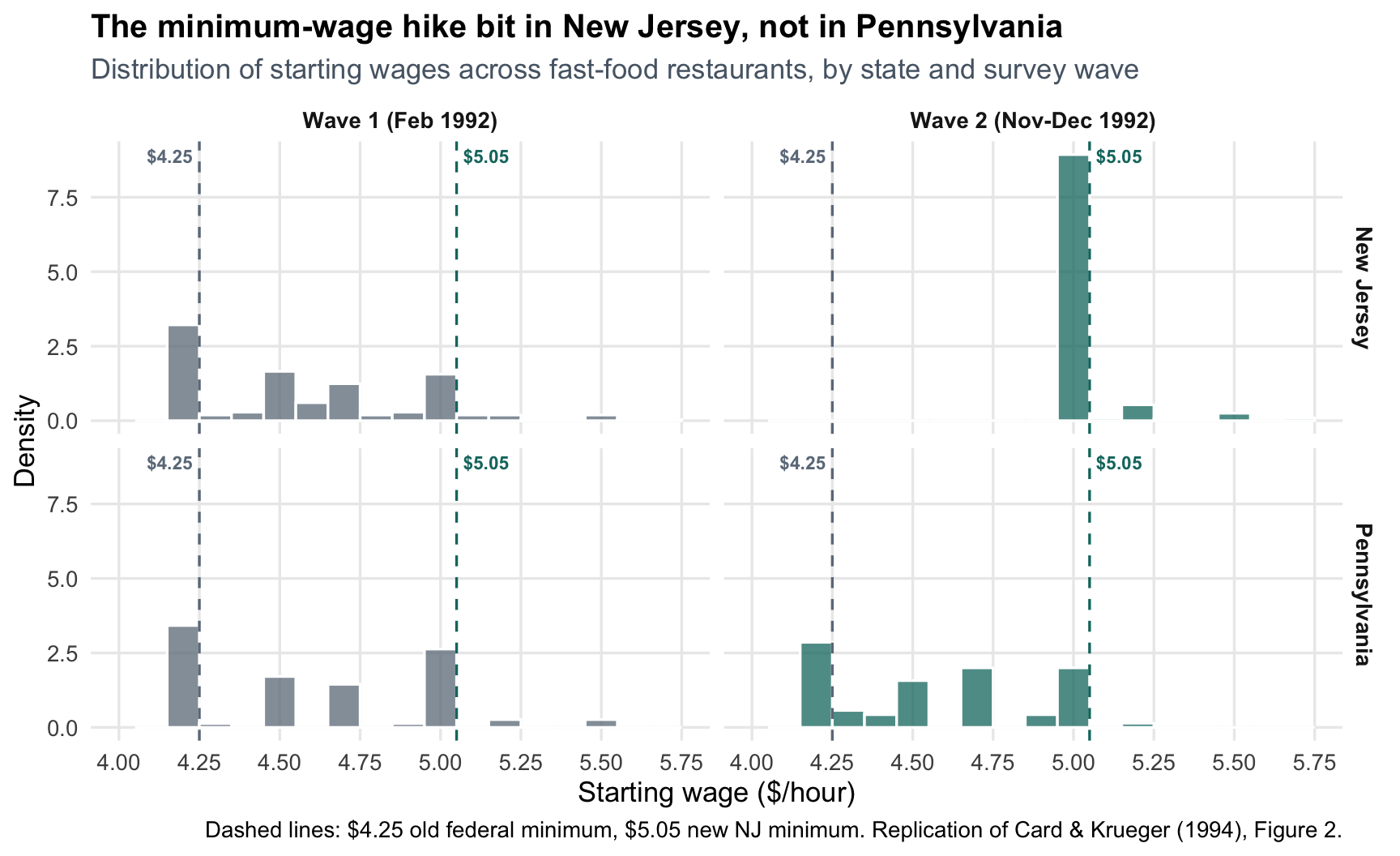
Table 3 shows *that* the policy moved wages in New Jersey. Figure 2 of the paper shows *how cleanly* it did so, and it is by far the most persuasive picture in the paper. The histograms below are the replication: they plot the distribution of starting wages across fast-food stores in each state, separately for wave 1 (February 1992, before the hike) and wave 2 (November-December 1992, after).
```{r fig.height=5.5}
wage_dist |>
  ggplot(aes(x = wage, fill = wave)) +
  geom_histogram(
    aes(y = after_stat(density)),
    binwidth = 0.1,
    position = position_identity(),
    alpha = 0.75,
    color = "white"
  ) +
  geom_vline(xintercept = 4.25, linetype = "dashed", color = "#6c7a89") +
  geom_vline(xintercept = 5.05, linetype = "dashed", color = "#0f766e") +
  annotate("text", x = 4.23, y = Inf, label = "$4.25",
           vjust = 1.6, hjust = 1, size = 3, color = "#6c7a89", fontface = "bold") +
  annotate("text", x = 5.07, y = Inf, label = "$5.05",
           vjust = 1.6, hjust = 0, size = 3, color = "#0f766e", fontface = "bold") +
  facet_grid(state_name ~ wave) +
  scale_fill_manual(values = c("Wave 1 (Feb 1992)" = "#6c7a89",
                                "Wave 2 (Nov-Dec 1992)" = "#0f766e")) +
  scale_x_continuous(limits = c(4.0, 5.75), breaks = seq(4.0, 5.75, 0.25)) +
  labs(
    title = "The minimum-wage hike bit in New Jersey, not in Pennsylvania",
    subtitle = "Distribution of starting wages across fast-food restaurants, by state and survey wave",
    x = "Starting wage ($/hour)",
    y = "Density",
    fill = NULL,
    caption = "Dashed lines: $4.25 old federal minimum, $5.05 new NJ minimum. Replication of Card & Krueger (1994), Figure 2."
  ) +
  theme(legend.position = "none", strip.text = element_text(face = "bold"))
```
The story the histogram tells is almost mechanical:
- In **wave 1**, both states cluster at or just above the old \$4.25 federal minimum. The two states look similar.
- In **wave 2**, the NJ distribution **collapses onto \$5.05** — the new binding minimum. Pennsylvania barely moves.
This is the "first stage" of the natural experiment: the policy really did reshape NJ wages, while PA served as a clean counterfactual. Without this picture, the Table 3 employment comparison would be much less convincing — a DiD estimate is only as credible as the treatment actually being different between groups.
### Rewriting Table 3 as a Visual Story
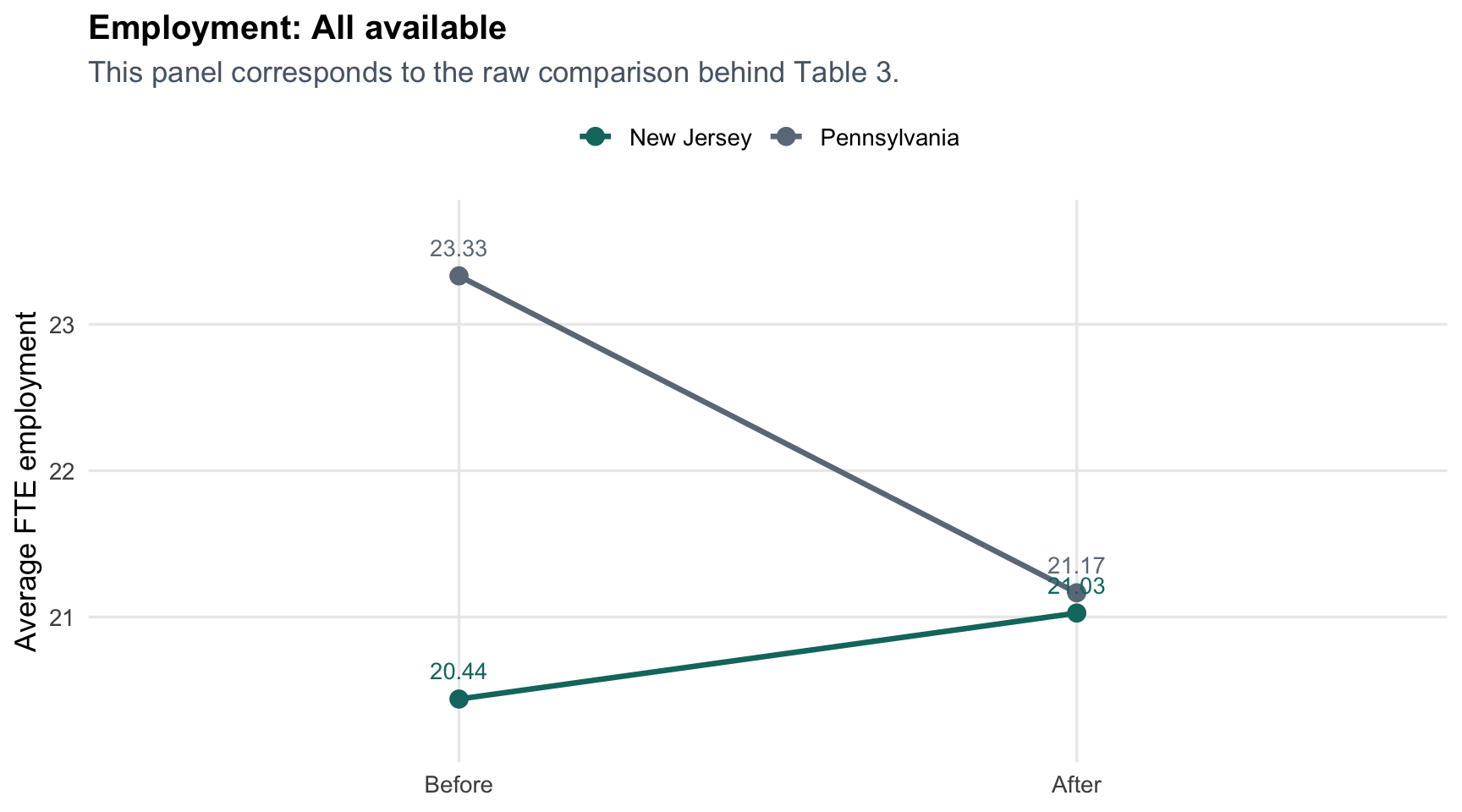
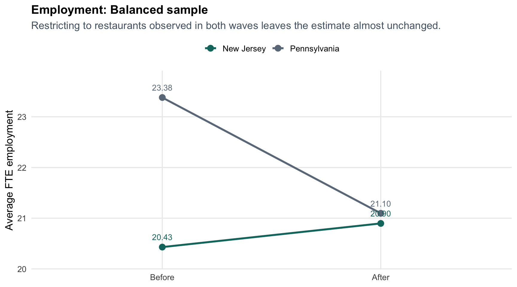
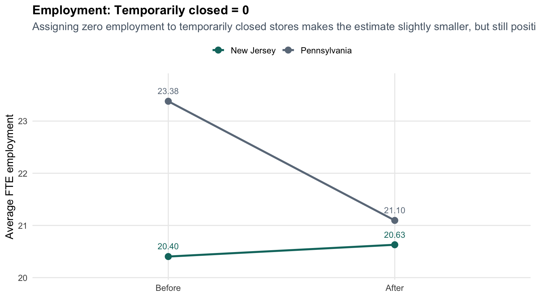
The paper gives the core result in a table. That is fine for replication, but it is not the easiest way to build intuition. The interactive tabbed module below uses the same data calculations as the table and lets you compare three sample definitions without relying on hard-coded values.
::: {.panel-tabset}
#### All available observations
```{r echo=FALSE}
make_sample_plot("All available", "This panel corresponds to the raw comparison behind Table 3.")
```
#### Balanced sample
```{r echo=FALSE}
make_sample_plot("Balanced sample", "Restricting to restaurants observed in both waves leaves the estimate almost unchanged.")
```
#### Temporarily closed stores set to zero
```{r echo=FALSE}
make_sample_plot("Temporarily closed = 0", "Assigning zero employment to temporarily closed stores makes the estimate slightly smaller, but still positive.")
```
:::
This is the same result as Table 3, but it reads more intuitively: Pennsylvania drifts downward, while New Jersey roughly holds steady or improves depending on the sample definition. The gap between those two trends is the DiD estimate.
### Sensitivity Check: Temporarily Closed Stores
```{r}
sensitivity_table |>
  gt(rowname_col = "sample") |>
  fmt_number(columns = c(`PA change`, `NJ change`, `Diff-in-Diff`), decimals = 2) |>
  tab_header(
    title = "Sensitivity of the DiD Estimate to Sample Definition",
    subtitle = "All values are computed directly from the public survey file"
  ) |>
  tab_source_note("This is my additional analysis beyond strict table replication.")
```
This is a better extra section than a purely decorative chart because it does something substantive. It shows that the exact treatment of temporarily closed stores matters at the margin, but it does **not** overturn the paper's central conclusion. The estimate shrinks from about **2.76** to **2.51**, which is movement worth acknowledging but not a reversal.
### Interpretation
There are three progressively better comparisons here:
1. **Cross-section only**: NJ stores were smaller than PA stores even before the policy change, so a simple after-period comparison is not useful.
2. **Before-after only**: employment falls in PA and rises slightly in NJ, but either state could also be affected by seasonality or macro conditions.
3. **Difference-in-Differences**: by comparing the change in NJ to the change in PA, we difference out common time shocks and get a much more credible estimate of the policy effect.
Taken together, Table 3 and Table 4 tell the same story: once the comparison is framed relative to Pennsylvania, the employment effect is not negative in the way a simple textbook model would predict.
## Why the DiD Framing Is the Right One
::: {.callout-important appearance="simple"}
If I only compared New Jersey before versus after, I might wrongly attribute any seasonal or regional macro movement to the minimum wage. If I only compared New Jersey and Pennsylvania after the policy, I would ignore the fact that PA stores started larger. DiD fixes both problems by asking a cleaner question: **how much did NJ change relative to PA?**
:::
The remaining caveat is the standard DiD caveat: parallel trends is an assumption, not something we observe directly with only two waves. That is why the neighboring-state comparison and the robustness checks around balanced samples matter.
### What I Learned
- The paper's headline claim survives replication surprisingly well with the public data.
- The most important move is not the regression. It is defining the right comparison.
- Turning the table into a visual made the logic much easier to follow than reading coefficients alone.
- For future finance or policy-analysis work, this project is a reminder that the core challenge is often not prediction accuracy but **credible counterfactual thinking**.
### Notes on Matching the Paper
My point estimates line up closely with the published numbers for the required rows and columns. Small differences in standard errors are expected and are consistent with the assignment note: the paper's exact treatment of subsamples, closures, and standard-error construction is a little idiosyncratic in places.