---
title: "MaxDiff Analysis of MSBA Class Preferences"
subtitle: "Counts, maximum likelihood, and Bayesian estimation of the MNL model"
description: "A MaxDiff analysis of UCSD Rady MSBA class preferences using counts, MNL maximum likelihood, and a hand-coded Metropolis sampler."
author: "Austin Li"
date: 2026-05-28
categories: [R, MaxDiff, MNL, Bayesian, Marketing Analytics]
format:
html:
toc: true
toc-depth: 3
code-fold: show
code-tools: true
df-print: kable
fig-align: center
fig-width: 9
fig-height: 5
execute:
warning: false
message: false
---
```{r}
#| label: setup
library(tidyverse)
library(gt)
library(scales)
library(forcats)

theme_set(
  theme_minimal(base_size = 12) +
    theme(
      plot.title = element_text(face = "bold"),
      plot.subtitle = element_text(color = "#5f6b75"),
      panel.grid.minor = element_blank(),
      legend.position = "bottom"
    )
)

course_palette <- c(
  "MGTA 403" = "#4E79A7",
  "MGTA 464" = "#F28E2B",
  "MGTA 451" = "#E15759",
  "MGTA 452" = "#76B7B2",
  "MGTA 453" = "#59A14F",
  "MGTA 444" = "#EDC948",
  "MGTA 455" = "#B07AA1",
  "MGTA 454" = "#FF9DA7",
  "MGTA 495" = "#9C755F",
  "MGTA 457" = "#BAB0AC"
)

log_sum_exp <- function(x) {
  m <- max(x)
  m + log(sum(exp(x - m)))
}

row_log_sum_exp <- function(mat) {
  m <- do.call(pmax, as.data.frame(mat))
  m + log(rowSums(exp(mat - m)))
}
```
## Introduction
MaxDiff, also called Best-Worst Scaling, is a survey method for measuring relative preference. Instead of asking respondents to rate every item on a 1-10 scale, the survey repeatedly shows a smaller set of items and asks for the most-preferred and least-preferred option. In this study, each valid screen shows four UCSD Rady MSBA core classes.
The logic from the MaxDiff lecture is that people are usually better at making trade-offs than calibrating numeric scales. A rating of "8" may mean different things to different people, but choosing the best and worst item on a screen forces direct differentiation. That makes MaxDiff useful for marketing questions like feature priority, claim testing, course preference, or product-bundle design.
This analysis estimates the relative appeal of 10 MSBA courses in three ways. First, I compute a simple counts score: percent chosen best minus percent chosen worst. Second, I estimate an aggregate multinomial logit (MNL) model by maximum likelihood. Third, I fit the same MNL model with a weakly informative Bayesian prior and a hand-coded random-walk Metropolis sampler. The three methods should broadly agree, especially at the top and bottom of the ranking, but they communicate uncertainty in different ways.
## The Data
```{r}
#| label: read-data
raw <- read_csv("../../../hw4/maxdiff_design_and_choices.csv", show_col_types = FALSE) |>
  rename(
    record_id = `Record ID`,
    task = Task,
    position = Position,
    item = Item,
    response = Response
  )

labels <- read_csv("../../../hw4/maxdiff_item_labels.csv", show_col_types = FALSE) |>
  select(item = `Item #`, label = Item) |>
  mutate(
    course = str_extract(label, "MGTA [0-9]+"),
    short_label = paste(course, str_extract(label, "(?<= )[A-Za-z.]+"))
  )

excluded_rows <- raw |>
  filter(task > 8 | item > 10)

maxdiff <- raw |>
  filter(task <= 8, item <= 10)

task_summary <- maxdiff |>
  group_by(record_id, task) |>
  summarise(
    items_per_task = n(),
    n_best = sum(response == 1),
    n_worst = sum(response == -1),
    n_neutral = sum(response == 0),
    .groups = "drop"
  ) |>
  mutate(valid_task = items_per_task == 4 & n_best == 1 & n_worst == 1 & n_neutral == 2)

data_summary <- tibble(
  statistic = c(
    "Respondents",
    "Tasks per respondent",
    "Items per valid task",
    "Items in study",
    "Rows used",
    "Rows excluded",
    "Invalid MaxDiff tasks after cleaning"
  ),
  value = c(
    n_distinct(maxdiff$record_id),
    paste(range(table(maxdiff$record_id) / 4), collapse = " to "),
    paste(range(task_summary$items_per_task), collapse = " to "),
    n_distinct(maxdiff$item),
    nrow(maxdiff),
    nrow(excluded_rows),
    sum(!task_summary$valid_task)
  )
)
```
The raw file contains some rows that do not match the MaxDiff structure described in the assignment. Specifically, tasks 9-15 include `Item = 11` and only two rows per task, while the class-label file defines only 10 course items. I therefore focus on the valid MaxDiff portion: tasks 1-8 and items 1-10.
```{r}
#| label: data-summary-table
data_summary |>
  gt() |>
  tab_header(title = "Data Structure After Cleaning")
```
```{r}
#| label: exposure-table
exposure <- maxdiff |>
  count(item, name = "times_shown") |>
  left_join(labels, by = "item") |>
  arrange(item)

exposure |>
  select(item, course, label, times_shown) |>
  gt() |>
  tab_header(title = "Exposure Balance by Course")
```
The cleaned data pass the key sanity check: every valid MaxDiff task has exactly four shown courses, one best pick, one worst pick, and two unchosen courses. Exposure is also reasonably balanced across courses, which is the point of a MaxDiff experimental design.
## Counts Analysis
The simplest MaxDiff summary uses the sufficient statistic emphasized in the MaxDiff slides:
$$
\text{score}_j = \%\text{best}_j - \%\text{worst}_j.
$$
For each course, I divide the number of best and worst picks by the number of times the course was shown. A positive score means a course is more often selected as best than worst. A negative score means it is more often selected as worst.
```{r}
#| label: counts-analysis
counts <- maxdiff |>
  group_by(item) |>
  summarise(
    times_shown = n(),
    times_best = sum(response == 1),
    times_worst = sum(response == -1),
    pct_best = times_best / times_shown,
    pct_worst = times_worst / times_shown,
    counts_score = pct_best - pct_worst,
    .groups = "drop"
  ) |>
  left_join(labels, by = "item")

set.seed(495)
B <- 1000
respondent_blocks <- split(maxdiff, maxdiff$record_id)
respondent_ids <- names(respondent_blocks)

bootstrap_scores <- map_dfr(seq_len(B), function(b) {
  sampled_ids <- sample(respondent_ids, length(respondent_ids), replace = TRUE)
  boot_df <- bind_rows(respondent_blocks[sampled_ids])

  boot_df |>
    group_by(item) |>
    summarise(
      score = sum(response == 1) / n() - sum(response == -1) / n(),
      .groups = "drop"
    ) |>
    mutate(rep = b)
})

count_intervals <- bootstrap_scores |>
  group_by(item) |>
  summarise(
    counts_low = quantile(score, 0.025),
    counts_high = quantile(score, 0.975),
    .groups = "drop"
  )

counts <- counts |>
  left_join(count_intervals, by = "item") |>
  mutate(counts_rank = min_rank(desc(counts_score))) |>
  arrange(counts_rank)
```
```{r}
#| label: counts-table
counts |>
  select(
    rank = counts_rank,
    course,
    label,
    times_shown,
    times_best,
    times_worst,
    pct_best,
    pct_worst,
    counts_score,
    counts_low,
    counts_high
  ) |>
  gt() |>
  fmt_percent(columns = c(pct_best, pct_worst, counts_score, counts_low, counts_high), decimals = 1) |>
  tab_header(title = "Counts Analysis: Percent Best Minus Percent Worst")
```
```{r}
#| label: counts-plot
ggplot(
  counts,
  aes(x = counts_score, y = fct_reorder(course, counts_score), fill = course)
) +
  geom_col(width = 0.72, show.legend = FALSE) +
  geom_errorbar(aes(xmin = counts_low, xmax = counts_high), width = 0.18, orientation = "y") +
  geom_vline(xintercept = 0, color = "gray45") +
  scale_x_continuous(labels = percent_format(accuracy = 1)) +
  scale_fill_manual(values = course_palette) +
  labs(
    title = "Simple MaxDiff Counts Scores",
    subtitle = "Bootstrap intervals resample respondents, preserving each respondent's set of tasks",
    x = "% best minus % worst",
    y = NULL
  )
```
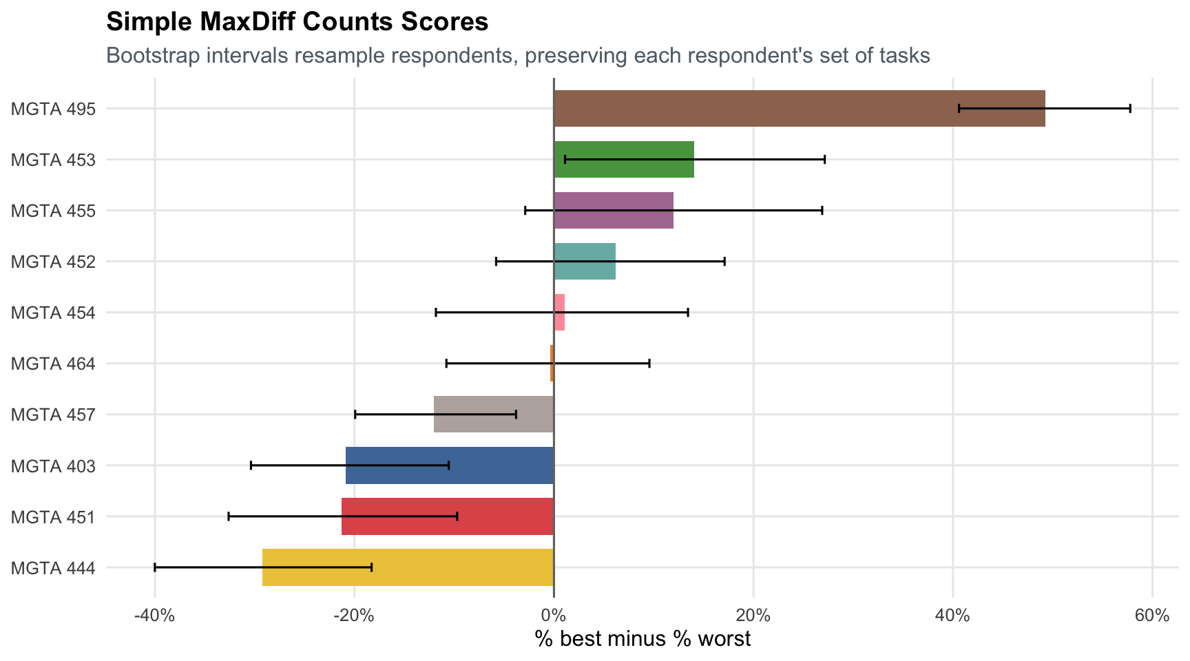
The counts analysis produces a clear top course: MGTA 495 Marketing Analytics. MGTA 453 Business Analytics and MGTA 455 Customer Analytics also perform well. The least preferred courses by this simple measure are MGTA 444 Analytics Consulting, MGTA 451 Marketing/Finance/Operations, and MGTA 403 AI Math, Programming, and Analytics. Counts are easy to explain, but they do not yet model the choice process explicitly.
## From MaxDiff Data to MNL Choices
The conjoint and MNL slides translate a choice task into a softmax probability:
$$
P(\text{choice}=j) =
\frac{\exp(V_j)}{\sum_k \exp(V_k)}.
$$
For this MaxDiff assignment, item identity is the only "attribute," so each course gets its own utility coefficient:
$$
V_j = \beta_j.
$$
A MaxDiff screen gives two implicit MNL observations. First, the respondent picks the best course from the four shown courses. Second, after removing the best course, the respondent picks the worst course from the remaining three. The worst-choice probability uses flipped utilities:
$$
P(\text{worst}=j) =
\frac{\exp(-\beta_j)}{\sum_k \exp(-\beta_k)}.
$$
Only utility differences are identified in a softmax model: adding the same constant to every $\beta_j$ leaves every choice probability unchanged. I therefore set $\beta_1 = 0$ and estimate the remaining nine coefficients relative to MGTA 403.
```{r}
#| label: mnl-data
choice_tasks <- maxdiff |>
  arrange(record_id, task, position) |>
  group_by(record_id, task) |>
  summarise(
    shown = list(item),
    best = first(item[response == 1]),
    worst = first(item[response == -1]),
    .groups = "drop"
  )

shown_mat <- do.call(rbind, choice_tasks$shown)
best_vec <- choice_tasks$best
worst_vec <- choice_tasks$worst
n_tasks <- nrow(shown_mat)

remaining_mat <- t(vapply(seq_len(n_tasks), function(i) {
  shown_mat[i, shown_mat[i, ] != best_vec[i]]
}, numeric(3)))
```
## MNL via Maximum Likelihood
The maximum likelihood estimate chooses the $\beta$ values that make the observed best and worst choices as probable as possible. For one task, the contribution is:
$$
\log P(\text{best}) + \log P(\text{worst} \mid \text{best removed}).
$$
Summing over all tasks gives the log-likelihood:
$$
\ell(\boldsymbol{\beta}) =
\sum_{\text{tasks}}
\left[
\beta_{j_b^*}
- \log \sum_{j \in \text{shown}}\exp(\beta_j)
- \beta_{j_w^*}
- \log \sum_{j \in \text{shown}\setminus j_b^*}\exp(-\beta_j)
\right].
$$
The implementation evaluates both denominator terms with a log-sum-exp helper rather than taking `log(sum(exp(x)))` directly. This is numerically more stable because it subtracts the largest utility before exponentiating, so very large or very small utilities are less likely to overflow or underflow during optimization and MCMC.
```{r}
#| label: mle-functions
maxdiff_ll <- function(beta_free) {
  beta <- c(0, beta_free)

  best_utilities <- matrix(beta[shown_mat], nrow = n_tasks, ncol = 4)
  worst_utilities <- matrix(-beta[remaining_mat], nrow = n_tasks, ncol = 3)

  sum(
    beta[best_vec] -
      row_log_sum_exp(best_utilities) +
      (-beta[worst_vec]) -
      row_log_sum_exp(worst_utilities)
  )
}

mle_fit <- optim(
  par = rep(0, 9),
  fn = maxdiff_ll,
  method = "BFGS",
  hessian = TRUE,
  control = list(fnscale = -1, maxit = 5000)
)

mle_beta <- c(0, mle_fit$par)
mle_se <- c(NA_real_, sqrt(diag(solve(-mle_fit$hessian))))
mle_share <- exp(mle_beta) / sum(exp(mle_beta))

mle_results <- tibble(
  item = 1:10,
  beta_mle = mle_beta,
  se_mle = mle_se,
  mle_share = mle_share
) |>
  left_join(labels, by = "item") |>
  mutate(mle_rank = min_rank(desc(mle_share))) |>
  arrange(mle_rank)
```
```{r}
#| label: mle-table
mle_results |>
  select(rank = mle_rank, course, label, beta_mle, se_mle, mle_share) |>
  gt() |>
  fmt_number(columns = c(beta_mle, se_mle), decimals = 3) |>
  fmt_percent(columns = mle_share, decimals = 1) |>
  sub_missing(columns = se_mle, missing_text = "Reference") |>
  tab_header(title = "MNL Maximum Likelihood Estimates")
```
```{r}
#| label: mle-plot
ggplot(
  mle_results,
  aes(x = mle_share, y = fct_reorder(course, mle_share), fill = course)
) +
  geom_col(width = 0.72, show.legend = FALSE) +
  scale_x_continuous(labels = percent_format(accuracy = 1)) +
  scale_fill_manual(values = course_palette) +
  labs(
    title = "MNL Shares of Preference from Maximum Likelihood",
    subtitle = "Shares answer: if all 10 classes were shown together, what share of choices would each receive?",
    x = "Share of preference",
    y = NULL
  )
```
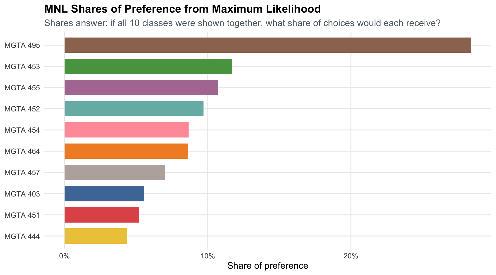
The MLE ranking is very similar to the counts ranking, especially at the top. This is expected from the MNL slides: MaxDiff counts are a strong summary of aggregate best-worst information. The model, however, gives a probability-based interpretation and standard errors from the Hessian.
## MNL via Bayesian Estimation
The Bayesian version uses the same likelihood, but combines it with a weakly informative prior:
$$
\boldsymbol{\beta} \sim N(\mathbf{0}, 10I).
$$
The posterior is proportional to likelihood times prior:
$$
\pi(\boldsymbol{\beta}\mid \boldsymbol{y}) \propto
L(\boldsymbol{\beta})\pi(\boldsymbol{\beta}).
$$
Because the softmax likelihood has no conjugate prior, I use the random-walk Metropolis algorithm from the Bayesian slides. The proposal is:
$$
\boldsymbol{\beta}^* =
\boldsymbol{\beta}_{t-1} + \epsilon,
\qquad
\epsilon \sim N(\mathbf{0}, s^2I).
$$
```{r}
#| label: bayes-functions
log_post <- function(beta_free) {
  maxdiff_ll(beta_free) + sum(dnorm(beta_free, 0, sqrt(10), log = TRUE))
}

mh_sampler <- function(beta0, n_iter, step) {
  K <- length(beta0)
  draws <- matrix(NA_real_, n_iter, K)
  beta <- beta0
  lp <- log_post(beta)
  accept <- 0L

  for (t in seq_len(n_iter)) {
    beta_star <- beta + rnorm(K, 0, step)
    lp_star <- log_post(beta_star)

    if (log(runif(1)) < lp_star - lp) {
      beta <- beta_star
      lp <- lp_star
      accept <- accept + 1L
    }

    draws[t, ] <- beta
  }

  list(draws = draws, accept_rate = accept / n_iter)
}

calc_rhat <- function(draw_mat) {
  n <- nrow(draw_mat)
  m <- ncol(draw_mat)
  chain_means <- colMeans(draw_mat)
  chain_vars <- apply(draw_mat, 2, var)
  W <- mean(chain_vars)
  B <- n * var(chain_means)
  var_hat <- ((n - 1) / n) * W + (B / n)
  sqrt(var_hat / W)
}

ess_one_chain <- function(x, max_lag = 1000) {
  x <- as.numeric(x)
  n <- length(x)

  if (n < 3 || sd(x) == 0) {
    return(NA_real_)
  }

  ac <- as.numeric(acf(x, lag.max = min(max_lag, n - 1), plot = FALSE)$acf)[-1]
  first_nonpositive <- which(ac <= 0)[1]

  if (!is.na(first_nonpositive)) {
    ac <- ac[seq_len(first_nonpositive - 1)]
  }

  tau <- 1 + 2 * sum(ac)
  min(n / tau, n)
}

calc_ess <- function(draw_mat) {
  ess_chains <- apply(draw_mat, 2, ess_one_chain)
  min(sum(ess_chains, na.rm = TRUE), length(draw_mat))
}

set.seed(495)
n_iter <- 20000
step_size <- 0.07
burn <- floor(0.25 * n_iter)
n_chains <- 4

initial_values <- list(
  chain_1 = rep(0, 9),
  chain_2 = rep(1.0, 9),
  chain_3 = rep(-1.0, 9),
  chain_4 = rnorm(9, 0, 1.5)
)

mh_fits <- map(
  initial_values,
  ~ mh_sampler(beta0 = .x, n_iter = n_iter, step = step_size)
)

free_names <- paste0("beta_", 2:10)

chain_array <- array(
  NA_real_,
  dim = c(n_iter, 9, n_chains),
  dimnames = list(iteration = NULL, parameter = free_names, chain = names(initial_values))
)

for (ch in seq_along(mh_fits)) {
  chain_array[, , ch] <- mh_fits[[ch]]$draws
}

post_free_array <- chain_array[(burn + 1):n_iter, , , drop = FALSE]
post_free <- do.call(rbind, lapply(seq_len(n_chains), function(ch) {
  post_free_array[, , ch, drop = FALSE][, , 1]
}))
colnames(post_free) <- free_names
post_beta <- cbind(beta_1 = 0, post_free)
colnames(post_beta) <- paste0("beta_", 1:10)

acceptance_tbl <- tibble(
  chain = names(mh_fits),
  start = c("all zeros", "all +1", "all -1", "random N(0, 1.5)"),
  accept_rate = map_dbl(mh_fits, "accept_rate")
)

accept_rate_mean <- mean(acceptance_tbl$accept_rate)
accept_rate_range <- range(acceptance_tbl$accept_rate)

rhat_values <- apply(post_free_array, 2, calc_rhat)
ess_values <- apply(post_free_array, 2, calc_ess)

mcmc_diagnostics <- tibble(
  parameter = free_names,
  rhat = as.numeric(rhat_values),
  ess = as.numeric(ess_values)
)

share_draws <- exp(post_beta)
share_draws <- sweep(share_draws, 1, rowSums(share_draws), "/")
colnames(share_draws) <- paste0("share_", 1:10)

bayes_results <- tibble(
  item = 1:10,
  beta_mean = colMeans(post_beta),
  beta_low = apply(post_beta, 2, quantile, 0.025),
  beta_high = apply(post_beta, 2, quantile, 0.975),
  bayes_share = colMeans(share_draws),
  share_low = apply(share_draws, 2, quantile, 0.025),
  share_high = apply(share_draws, 2, quantile, 0.975)
) |>
  left_join(labels, by = "item") |>
  mutate(bayes_rank = min_rank(desc(bayes_share))) |>
  arrange(bayes_rank)
```
The mean sampler acceptance rate is `r percent(accept_rate_mean, accuracy = 0.1)` across four chains, with chain-specific rates from `r percent(accept_rate_range[1], accuracy = 0.1)` to `r percent(accept_rate_range[2], accuracy = 0.1)`. This falls in the 25-40% range recommended in the Bayesian MCMC slides.
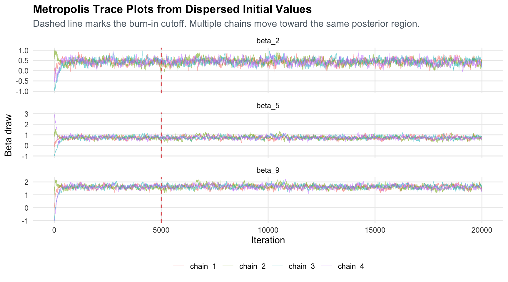
Starting all chains at the MLE would make the trace plots look tidy, but it would not be a strong diagnostic: the chain would already begin near the high-posterior region. Here the four chains start from deliberately dispersed values. If those chains move toward the same stationary region after burn-in, it is evidence that the result is not just an artifact of one convenient starting point. R-hat formalizes this idea by comparing between-chain variation to within-chain variation; values close to 1 indicate that chains agree. ESS asks a different question: after accounting for autocorrelation, how many independent draws is the MCMC output roughly worth?
```{r}
#| label: trace-plot
trace_plot_data <- map_dfr(seq_len(n_chains), function(ch) {
  as_tibble(chain_array[, c("beta_2", "beta_5", "beta_9"), ch]) |>
    mutate(
      iteration = row_number(),
      chain = names(initial_values)[ch]
    )
}) |>
  pivot_longer(
    cols = c(beta_2, beta_5, beta_9),
    names_to = "parameter",
    values_to = "draw"
  )

ggplot(trace_plot_data, aes(x = iteration, y = draw, color = chain)) +
  geom_line(linewidth = 0.22, alpha = 0.55) +
  geom_vline(xintercept = burn, linetype = "dashed", color = "#E15759") +
  facet_wrap(~ parameter, scales = "free_y", ncol = 1) +
  labs(
    title = "Metropolis Trace Plots from Dispersed Initial Values",
    subtitle = "Dashed line marks the burn-in cutoff. Multiple chains move toward the same posterior region.",
    x = "Iteration",
    y = "Beta draw",
    color = NULL
  )
```
```{r}
#| label: diagnostics-table
mcmc_diagnostics |>
  gt() |>
  fmt_number(columns = rhat, decimals = 3) |>
  fmt_number(columns = ess, decimals = 0) |>
  tab_header(title = "MCMC Diagnostics After Burn-in")
```
```{r}
#| label: bayes-table
bayes_results |>
  select(
    rank = bayes_rank,
    course,
    label,
    beta_mean,
    beta_low,
    beta_high,
    bayes_share,
    share_low,
    share_high
  ) |>
  gt() |>
  fmt_number(columns = c(beta_mean, beta_low, beta_high), decimals = 3) |>
  fmt_percent(columns = c(bayes_share, share_low, share_high), decimals = 1) |>
  tab_header(title = "Bayesian MNL Posterior Summaries")
```
```{r}
#| label: bayes-plot
ggplot(
  bayes_results,
  aes(x = bayes_share, y = fct_reorder(course, bayes_share), fill = course)
) +
  geom_col(width = 0.72, show.legend = FALSE) +
  geom_errorbar(aes(xmin = share_low, xmax = share_high), width = 0.18, orientation = "y") +
  scale_x_continuous(labels = percent_format(accuracy = 1)) +
  scale_fill_manual(values = course_palette) +
  labs(
    title = "Bayesian MNL Shares of Preference",
    subtitle = "Intervals are posterior 95% credible intervals for each share",
    x = "Posterior share of preference",
    y = NULL
  )
```
```{r}
#| label: mle-bayes-check
mle_bayes_check <- mle_results |>
  select(item, course, label, beta_mle, mle_share) |>
  left_join(
    bayes_results |>
      select(item, beta_mean, bayes_share),
    by = "item"
  )

beta_alignment_cor <- cor(mle_bayes_check$beta_mle, mle_bayes_check$beta_mean)
share_alignment_cor <- cor(mle_bayes_check$mle_share, mle_bayes_check$bayes_share)

mle_bayes_check |>
  arrange(desc(mle_share)) |>
  gt() |>
  fmt_number(columns = c(beta_mle, beta_mean), decimals = 3) |>
  fmt_percent(columns = c(mle_share, bayes_share), decimals = 1) |>
  tab_header(title = "MLE and Bayesian Estimates Are Consistent")
```
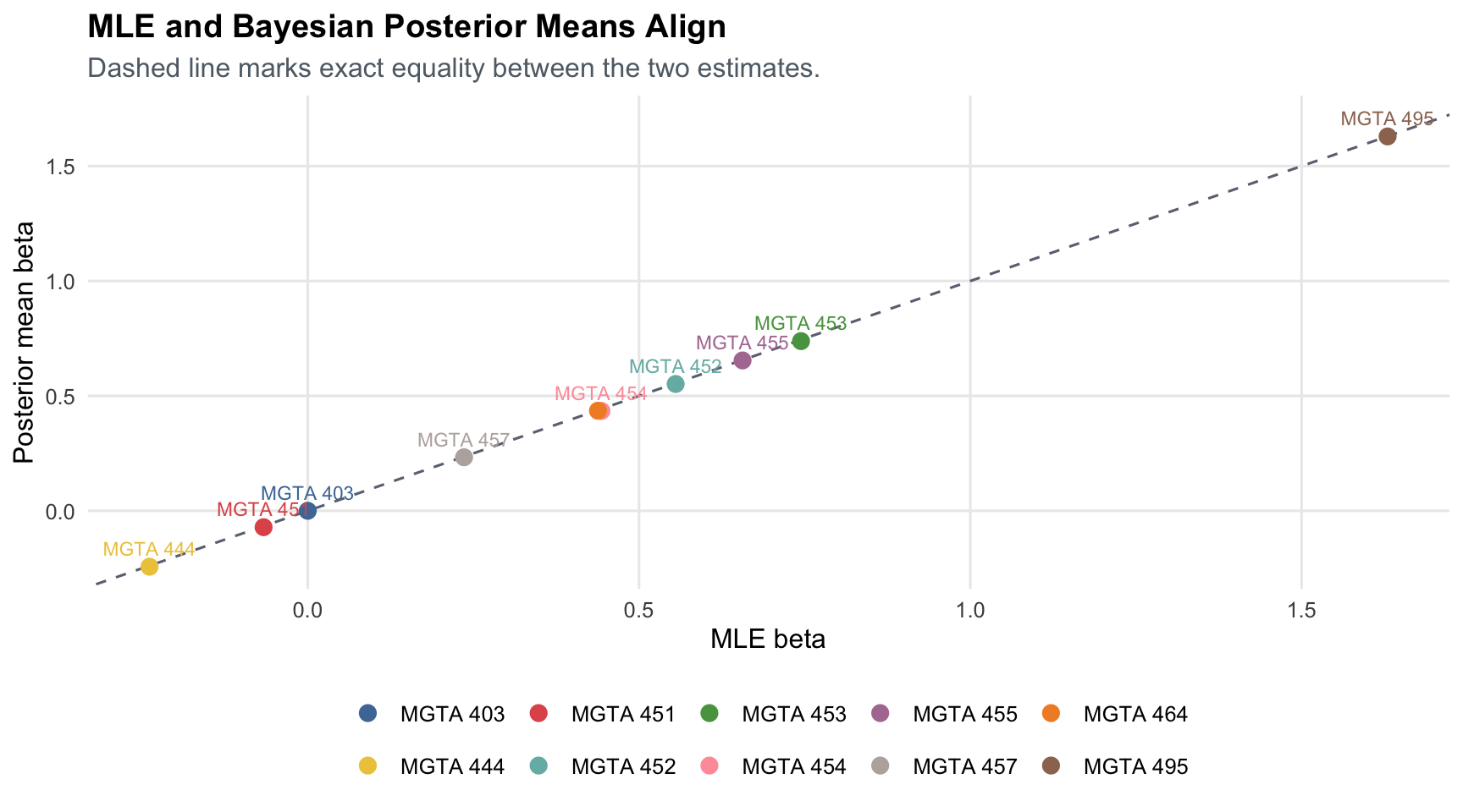
```{r}
#| label: mle-bayes-scatter
ggplot(
  mle_bayes_check,
  aes(x = beta_mle, y = beta_mean, color = course, label = course)
) +
  geom_abline(intercept = 0, slope = 1, linetype = "dashed", color = "#6b7280") +
  geom_point(size = 3) +
  geom_text(nudge_y = 0.08, size = 3, show.legend = FALSE, check_overlap = TRUE) +
  scale_color_manual(values = course_palette, drop = FALSE) +
  labs(
    title = "MLE and Bayesian Posterior Means Align",
    subtitle = "Dashed line marks exact equality between the two estimates.",
    x = "MLE beta",
    y = "Posterior mean beta",
    color = NULL
  )
```
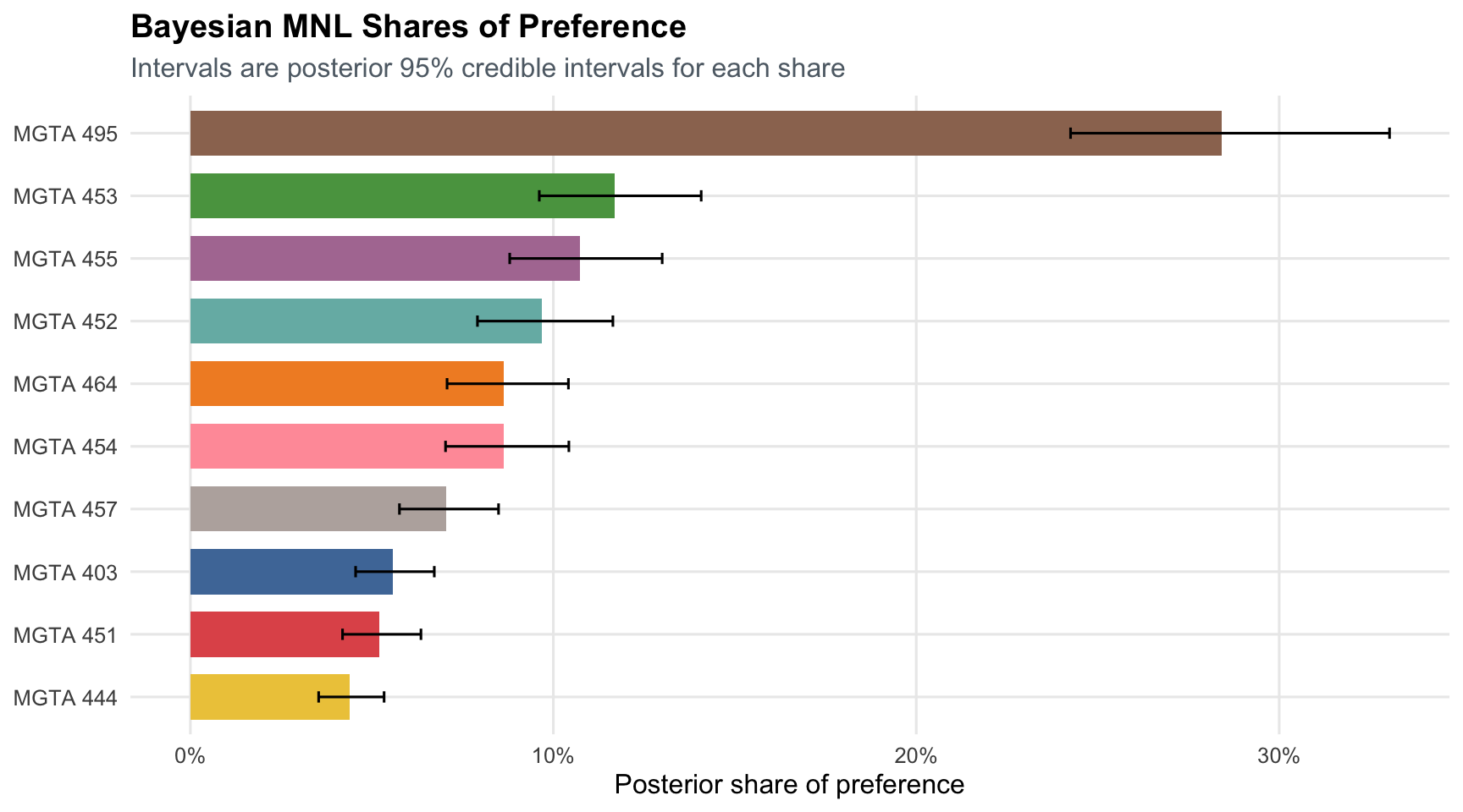
The Bayesian posterior means are close to the MLE point estimates: the beta correlation is `r number(beta_alignment_cor, accuracy = 0.001)`, and the preference-share correlation is `r number(share_alignment_cor, accuracy = 0.001)`. This makes sense because the prior is weak and the data are informative. The benefit of the Bayesian workflow is that uncertainty for derived quantities is direct: I compute shares for every posterior draw and then summarize those share draws with means and credible intervals.
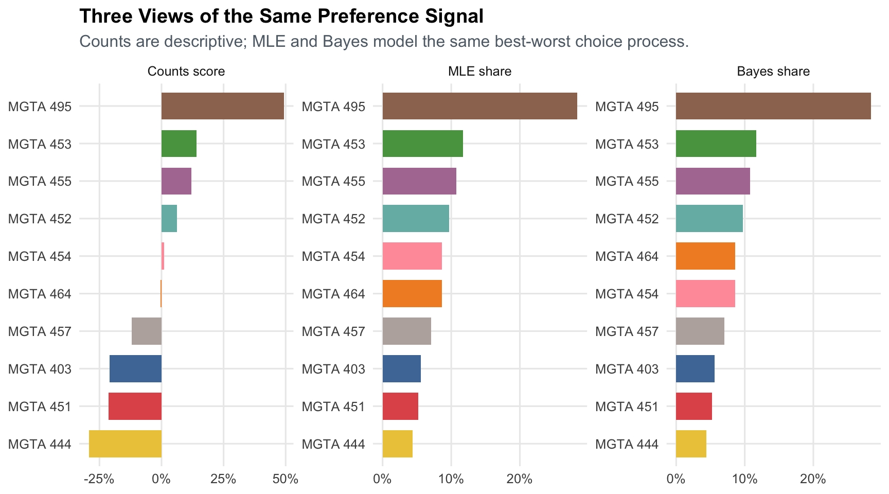
## Comparing the Three Methods
```{r}
#| label: comparison
comparison <- counts |>
  select(item, course, label, counts_score, counts_rank) |>
  left_join(mle_results |> select(item, beta_mle, se_mle, mle_share, mle_rank), by = "item") |>
  left_join(
    bayes_results |>
      select(item, beta_mean, beta_low, beta_high, bayes_share, share_low, share_high, bayes_rank),
    by = "item"
  ) |>
  arrange(mle_rank)

comparison |>
  select(
    course,
    label,
    counts_score,
    counts_rank,
    mle_share,
    mle_rank,
    bayes_share,
    bayes_rank
  ) |>
  gt() |>
  fmt_percent(columns = c(counts_score, mle_share, bayes_share), decimals = 1) |>
  tab_header(title = "Comparison of Counts, MLE MNL, and Bayesian MNL")
```
```{r}
#| label: comparison-plot
comparison_long <- bind_rows(
  comparison |>
    transmute(method = "Counts score", course, value = counts_score),
  comparison |>
    transmute(method = "MLE share", course, value = mle_share),
  comparison |>
    transmute(method = "Bayes share", course, value = bayes_share)
) |>
  mutate(
    method = factor(method, levels = c("Counts score", "MLE share", "Bayes share")),
    course_panel = fct_reorder(paste(method, course, sep = "__"), value)
  )

ggplot(comparison_long, aes(x = value, y = course_panel, fill = course)) +
  geom_col(width = 0.72, show.legend = FALSE) +
  facet_wrap(~ method, scales = "free") +
  scale_y_discrete(labels = function(x) str_replace(x, "^.*__", "")) +
  scale_x_continuous(labels = percent_format(accuracy = 1)) +
  scale_fill_manual(values = course_palette, drop = FALSE) +
  labs(
    title = "Three Views of the Same Preference Signal",
    subtitle = "Counts are descriptive; MLE and Bayes model the same best-worst choice process.",
    x = NULL,
    y = NULL
  )
```
All three methods agree that MGTA 495 is the most preferred course in this sample. They also broadly agree on the least preferred courses. Differences are most visible in the middle of the ranking, where course utilities are closer together and small amounts of sampling noise can flip ranks.
The MNL model adds structure over counts because it explicitly models each choice set. A shown but unchosen item still contributes information: it lost that particular comparison. Bayesian MNL adds a convenient way to communicate uncertainty for transformed quantities, such as shares of preference, because every posterior draw can be pushed through the softmax.
## Discussion
Substantively, MSBA students in this survey show the strongest preference for MGTA 495 Marketing Analytics, followed by MGTA 453 Business Analytics and MGTA 455 Customer Analytics. That ranking is reassuring for this assignment, since the analysis is being conducted in the marketing analytics course itself, but it may also reflect the sample's interests and timing.
Methodologically, the three approaches answer related but slightly different questions. Counts are best for a quick dashboard-style summary. MLE MNL is better when we want a formal choice model, point estimates, standard errors, and a probability interpretation. Bayesian MNL is most useful when we want uncertainty on derived quantities or when we want to extend the model to hierarchical Bayes and individual-level preferences.
The main caveat is external validity. The respondents are a self-selected sample of MSBA students, not a random sample of every possible student. Preferences may also depend on prior coursework, the quarter when the class is taken, instructor expectations, and current career goals. With more time, I would extend this model hierarchically to estimate respondent-level part-worths and then ask whether preference segments exist within the MSBA cohort.