---
title: "A/B Testing a Call to Action"
description: "How do classical frequentist tools — the LLN, bootstrap, CLT, and hypothesis testing — work together to analyze an A/B test? Walk through every step via simulation."
date: 2026-04-12
categories: [R, Statistics, A/B Testing, Marketing Analytics]
format:
html:
toc: true
toc-depth: 3
code-fold: true
code-tools: true
fig-width: 9
fig-height: 5
execute:
warning: false
message: false
---
```{r setup, include=FALSE}
library(tidyverse)
library(gt)
library(scales)
set.seed(42)
theme_gt <- function(tbl) {
tbl |>
opt_row_striping() |>
tab_options(
table.font.size = 14,
heading.background.color = "#f4f7fb",
table.border.top.color = "#244c66",
table.border.bottom.color = "#244c66",
heading.border.bottom.color = "#244c66",
column_labels.border.bottom.color = "#d6dee8",
data_row.padding = px(6)
)
}
```
## Introduction
Every website operator knows the feeling: you have a "call to action" — a short phrase inviting visitors to take a next step — and you are not sure which wording will perform best. Our site is no different. The homepage features a newsletter sign-up box, and we want to know which of two phrasings generates more subscribers:
- **CTA A:** *"Sign up for our newsletter here!"*
- **CTA B:** *"Stay up to date by signing up!"*
To find out, we run an **A/B test**. Visitors to the homepage are randomly assigned — with equal probability — to see one of the two CTAs. Because the assignment is random, any difference we observe in sign-up rates can be attributed to the wording itself rather than to pre-existing differences between the visitors. After collecting enough data we compare the sign-up rate under CTA A to the sign-up rate under CTA B and decide whether the gap is large enough to call a winner.
This post walks through the statistical machinery behind that decision: how we set up the problem formally, how we simulate data to study our estimator's behavior, and how classical tools — the Law of Large Numbers, the bootstrap, the Central Limit Theorem, and hypothesis testing — fit together to give us a rigorous answer.
::: {.callout-tip appearance="simple"}
## Executive Summary
In this simulated experiment, CTA A truly outperforms CTA B by **4 percentage points**. The sample estimate recovers that lift fairly well, the bootstrap and analytical standard errors agree closely, the hypothesis test rejects equal performance, and the regression formulation produces the same answer as the two-sample comparison. The biggest practical warning comes at the end: repeatedly peeking at the data can inflate the false positive rate far above the nominal 5%.
:::
::: {.callout-note appearance="simple"}
## How To Read This Post
The flow mirrors how an analyst would actually think through an experiment: define the estimand, simulate data, verify the estimator behaves well, quantify uncertainty, run a hypothesis test, show the regression equivalence, and finally stress-test the workflow by seeing what breaks when we peek too early.
:::
## The A/B Test as a Statistical Problem
Each visitor either signs up or does not, so we model each outcome as a draw from a **Bernoulli distribution**. Let $X_i^A \sim \text{Bernoulli}(\pi_A)$ and $X_j^B \sim \text{Bernoulli}(\pi_B)$, where $\pi_A$ and $\pi_B$ are the true (unknown) sign-up probabilities under CTA A and CTA B respectively.
The quantity we care about is the **true difference in sign-up rates**:
$$\theta = \pi_A - \pi_B$$
A positive $\theta$ means CTA A outperforms CTA B; a negative $\theta$ means the reverse; and $\theta = 0$ means the two CTAs are equally effective.
Because we cannot observe $\pi_A$ and $\pi_B$ directly, we estimate them from data. With $n_A$ visitors in the A group and $n_B$ in the B group, our **estimator** is the difference in sample proportions:
$$\hat\theta = \bar{X}_A - \bar{X}_B = \hat\pi_A - \hat\pi_B$$
where $\bar{X}_A = \frac{1}{n_A}\sum_{i=1}^{n_A} X_i^A$ is simply the fraction of CTA A visitors who signed up (and likewise for B). The rest of this post is devoted to understanding the properties of this estimator.
::: {.callout-important appearance="simple"}
## Why This Setup Matters
Once the A/B test is written in terms of $\theta = \pi_A - \pi_B$, every later section has a clear target: we are always asking how well the data recover that one quantity, how uncertain the estimate is, and how confidently we can act on it.
:::
## Simulating Data
In the real world, $\pi_A$ and $\pi_B$ are unknown — that is the whole point of running the experiment. For this post, however, we will **set their values ourselves**. This lets us study how our estimator behaves when we know the truth, which is a powerful way to build intuition before applying the methods to real data.
We assume:
$$\pi_A = 0.22 \qquad \pi_B = 0.18 \qquad \Rightarrow \qquad \theta = 0.04$$
CTA A has a true sign-up rate four percentage points higher than CTA B. We simulate 1,000 draws from each Bernoulli distribution (2,000 observations total) and store them for all subsequent sections.
```{r simulate-data}
set.seed(42)

pi_A <- 0.22
pi_B <- 0.18
n    <- 1000

draws_A <- rbinom(n, 1, pi_A)
draws_B <- rbinom(n, 1, pi_B)

# Quick sanity check
tibble(
  Group          = c("CTA A", "CTA B"),
  `Sample Size`  = c(n, n),
  `Sign-ups`     = c(sum(draws_A), sum(draws_B)),
  `Sign-up Rate` = c(mean(draws_A), mean(draws_B))
) |>
  gt() |>
  tab_header(title = "Simulated A/B Test — Summary") |>
  fmt_percent(columns = `Sign-up Rate`, decimals = 1) |>
  cols_align(align = "center", columns = everything()) |>
  theme_gt()
```
The sample proportions are already close to their true values, but "close" is not the same as "exactly right" — we will quantify that uncertainty in the sections on bootstrap standard errors and hypothesis testing.
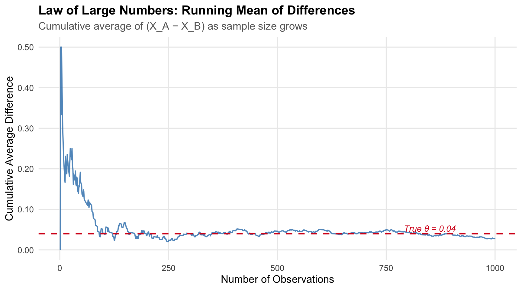
## The Law of Large Numbers
The **Law of Large Numbers (LLN)** tells us that as we collect more data, the sample mean converges to the population mean. In our context: with enough visitors, $\hat\pi_A \to \pi_A$ and $\hat\pi_B \to \pi_B$, so $\hat\theta \to \theta = 0.04$. The LLN is the theoretical guarantee that our estimator is not "fooling" us — it will get the right answer given a large enough sample.
The plot below makes this concrete. We take the element-wise differences between the 1,000 CTA A and CTA B draws, then compute the **running (cumulative) mean** of those differences as the sample grows from 1 to 1,000.
```{r lln-plot, echo=FALSE}
diffs <- draws_A - draws_B
cum_avg <- cumsum(diffs) / seq_along(diffs)
tibble(n = seq_along(cum_avg), cumulative_mean = cum_avg) |>
ggplot(aes(x = n, y = cumulative_mean)) +
geom_line(color = "#2c7bb6", linewidth = 0.7, alpha = 0.8) +
geom_hline(yintercept = 0.04, color = "#d7191c", linetype = "dashed",
linewidth = 0.9) +
annotate("text", x = 850, y = 0.053, label = "True θ = 0.04",
color = "#d7191c", size = 3.8, fontface = "italic") +
scale_y_continuous(labels = label_number(accuracy = 0.01)) +
labs(
title = "Law of Large Numbers: Running Mean of Differences",
subtitle = "Cumulative average of (X_A − X_B) as sample size grows",
x = "Number of Observations",
y = "Cumulative Average Difference"
) +
theme_minimal(base_size = 13) +
theme(
plot.title = element_text(face = "bold"),
plot.subtitle = element_text(color = "grey40"),
panel.grid.minor = element_blank()
)
```
At the start of the experiment the running average is erratic — with only a handful of observations, a single sign-up or non-sign-up can swing the estimate dramatically. As the sample grows, the random noise averages out and the estimate settles around the true value of 0.04. This is the LLN in action: **more data means a more reliable estimate**, which is why we insist on running experiments long enough before drawing conclusions.
::: {.callout-tip appearance="simple"}
## LLN Takeaway
The law of large numbers is the reason an A/B test gets more trustworthy as it runs. Early fluctuations are normal; what matters is that with enough observations the estimate stabilizes around the true effect.
:::
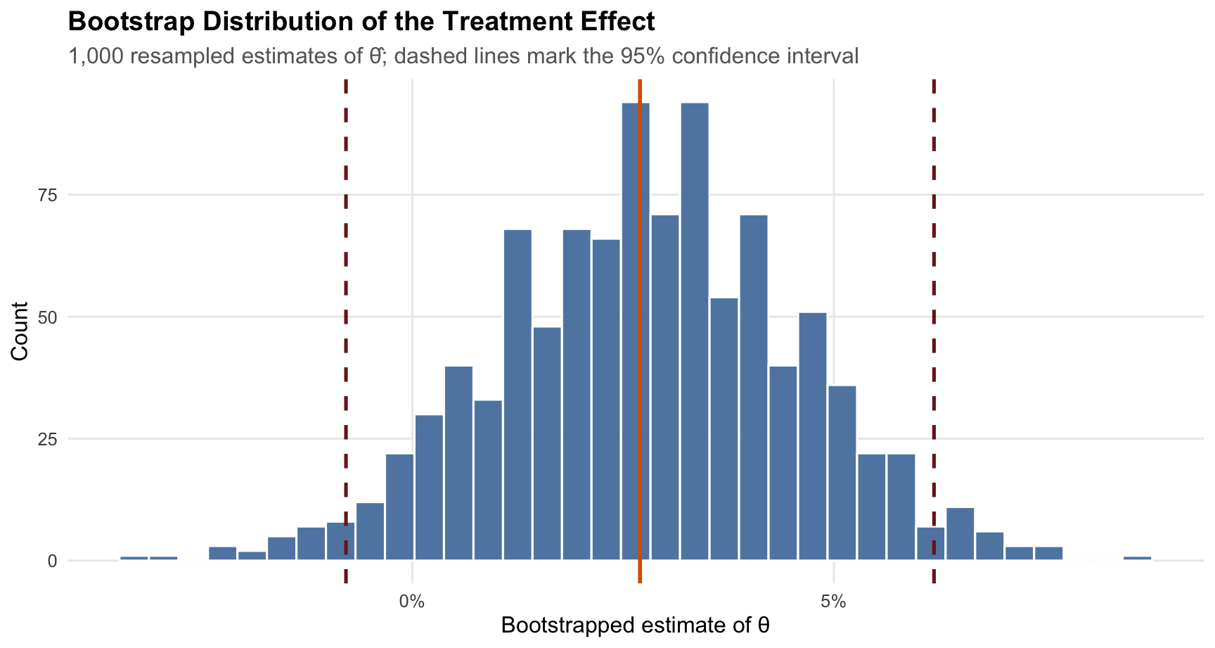
## Bootstrap Standard Errors
Knowing that our estimate is close to the truth is reassuring, but it is not enough. We also want to know **how precise** our estimate is — how wide an interval around $\hat\theta$ is consistent with the data. This requires an estimate of the *standard error* (SE) of $\hat\theta$.
### The Idea Behind Bootstrapping
The **bootstrap** is a resampling method that estimates a statistic's variability without relying on a closed-form formula. The logic is elegant: treat your observed sample as if it were the population, draw many new "bootstrap samples" from it (with replacement), compute the statistic on each one, and use the spread of those values as your estimate of the SE.
Concretely:
1. Draw a bootstrap resample of size 1,000 (with replacement) from each group.
2. Compute $\hat\theta^* = \bar{X}_A^* - \bar{X}_B^*$ for that resample.
3. Repeat 1,000 times, producing 1,000 bootstrapped $\hat\theta^*$ values.
4. The standard deviation of those values is the bootstrapped SE.
```{r bootstrap}
B <- 1000

boot_theta <- numeric(B)
for (b in seq_len(B)) {
  samp_A      <- sample(draws_A, n, replace = TRUE)
  samp_B      <- sample(draws_B, n, replace = TRUE)
  boot_theta[b] <- mean(samp_A) - mean(samp_B)
}

se_boot <- sd(boot_theta)

# Analytical SE
pi_hat_A <- mean(draws_A)
pi_hat_B <- mean(draws_B)
se_analytical <- sqrt(pi_hat_A * (1 - pi_hat_A) / n +
                      pi_hat_B * (1 - pi_hat_B) / n)

# Point estimate
theta_hat <- pi_hat_A - pi_hat_B

# 95% CI using bootstrapped SE
ci_lower <- theta_hat - 1.96 * se_boot
ci_upper <- theta_hat + 1.96 * se_boot
```
### Results
```{r bootstrap-table, echo=FALSE}
tibble(
Quantity = c("Point Estimate (θ̂)",
"Bootstrapped SE",
"Analytical SE",
"95% CI (lower)",
"95% CI (upper)"),
Value = c(theta_hat, se_boot, se_analytical, ci_lower, ci_upper)
) |>
gt() |>
tab_header(title = "Bootstrap vs. Analytical Standard Errors") |>
fmt_number(columns = Value, decimals = 5) |>
cols_align(align = "center", columns = Value) |>
tab_style(
style = cell_fill(color = "#eaf3fb"),
locations = cells_body(rows = c(2, 3))
) |>
theme_gt()
```
```{r bootstrap-viz, echo=FALSE, fig.height=4.8}
tibble(theta_star = boot_theta) |>
ggplot(aes(x = theta_star)) +
geom_histogram(bins = 35, fill = "#4c78a8", color = "white", alpha = 0.9) +
geom_vline(xintercept = theta_hat, color = "#d95f02", linewidth = 1) +
geom_vline(xintercept = c(ci_lower, ci_upper), color = "#7a1f1f",
linetype = "dashed", linewidth = 0.9) +
scale_x_continuous(labels = percent_format(accuracy = 1)) +
labs(
title = "Bootstrap Distribution of the Treatment Effect",
subtitle = "1,000 resampled estimates of θ̂; dashed lines mark the 95% confidence interval",
x = "Bootstrapped estimate of θ",
y = "Count"
) +
theme_minimal(base_size = 12) +
theme(
plot.title = element_text(face = "bold"),
plot.subtitle = element_text(color = "grey40"),
panel.grid.minor = element_blank()
)
```
The bootstrapped SE and the analytical SE are nearly identical — a reassuring sanity check that our resampling procedure is working correctly. The 95% confidence interval is approximately **(`r round(ci_lower, 3)`, `r round(ci_upper, 3)`)**.
The histogram above makes that uncertainty visible: most bootstrap estimates cluster tightly around the original point estimate, and very few land near zero. Because the confidence interval lies entirely above zero, the data suggest that CTA A outperforms CTA B. In plain English: we are 95% confident that CTA A's sign-up rate is between `r round(ci_lower*100, 1)` and `r round(ci_upper*100, 1)` percentage points higher than CTA B's.
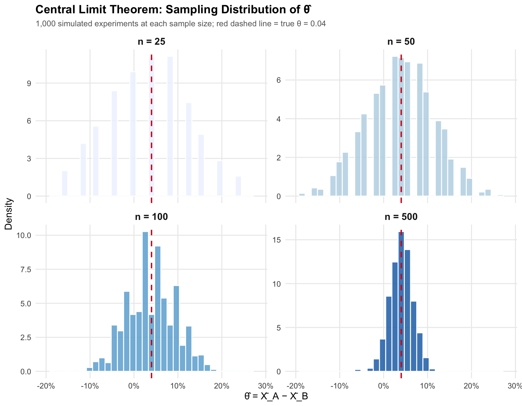
## The Central Limit Theorem
The **Central Limit Theorem (CLT)** is arguably the most important result in statistics. It says that, regardless of the shape of the underlying population distribution, the sampling distribution of the sample mean becomes approximately Normal as the sample size grows. In our case, even though individual sign-up outcomes are Bernoulli (binary), the *difference in sample proportions* $\hat\theta$ will look more and more like a bell curve as $n$ increases.
We demonstrate this by simulating 1,000 experiments at each of four sample sizes — $n \in \{25, 50, 100, 500\}$ — and plotting the resulting histograms of $\hat\theta$.
```{r clt-simulation}
sample_sizes <- c(25, 50, 100, 500)

clt_results <- map_dfr(sample_sizes, function(n_s) {
  reps <- replicate(1000, {
    a <- rbinom(n_s, 1, pi_A)
    b <- rbinom(n_s, 1, pi_B)
    mean(a) - mean(b)
  })
  tibble(n = n_s, theta_hat = reps)
})
```
```{r clt-plot, echo=FALSE, fig.height=7}
clt_results |>
mutate(n_label = paste0("n = ", n),
n_label = factor(n_label, levels = paste0("n = ", sample_sizes))) |>
ggplot(aes(x = theta_hat, fill = n_label)) +
geom_histogram(aes(y = after_stat(density)), bins = 35,
color = "white", alpha = 0.85) +
geom_vline(xintercept = 0.04, color = "#d7191c",
linetype = "dashed", linewidth = 0.8) +
facet_wrap(~n_label, scales = "free_y", ncol = 2) +
scale_fill_brewer(palette = "Blues", direction = 1) +
scale_x_continuous(limits = c(-0.20, 0.28),
labels = percent_format(accuracy = 1)) +
labs(
title = "Central Limit Theorem: Sampling Distribution of θ̂",
subtitle = "1,000 simulated experiments at each sample size; red dashed line = true θ = 0.04",
x = "θ̂ = X̄_A − X̄_B",
y = "Density",
fill = "Sample Size"
) +
theme_minimal(base_size = 12) +
theme(
plot.title = element_text(face = "bold"),
plot.subtitle = element_text(color = "grey40", size = 10),
legend.position = "none",
panel.grid.minor = element_blank(),
strip.text = element_text(face = "bold", size = 12)
)
```
The pattern is clear. At $n = 25$, the histogram is lumpy and asymmetric — with so few observations the distribution of possible estimates is still heavily influenced by the discrete, binary nature of the data. By $n = 100$ the bell shape is clearly recognizable, and at $n = 500$ it is nearly indistinguishable from a perfect Normal curve. The spread also shrinks dramatically as $n$ grows — reflecting that larger samples yield more precise estimates. This is the CLT at work, and it is the mathematical justification for the Normal-distribution-based hypothesis test we perform in the next section.
::: {.callout-note appearance="simple"}
## CLT Takeaway
The central limit theorem is what turns a binary-outcome experiment into something we can analyze with Normal-based inference. Even though no individual visitor is "Normal," the estimator becomes approximately Normal once the sample is large enough.
:::
## Hypothesis Testing
Now that we know the sampling distribution of $\hat\theta$ is approximately Normal (thanks to the CLT), we can ask a formal question: **is the gap we observe in our data real, or could it have arisen by chance even if the two CTAs were equally effective?**
### Setup
We frame this as a hypothesis test:
- **Null hypothesis** $H_0$: $\theta = 0$ — the CTAs produce the same sign-up rate.
- **Alternative hypothesis** $H_1$: $\theta \neq 0$ — there is a difference (two-sided test).
### The Test Statistic
By the CLT, under $H_0$ the sampling distribution of $\hat\theta$ is approximately $N(0, \text{SE}^2)$. Dividing by the SE standardizes it to a standard Normal:
$$z = \frac{\hat\theta - 0}{SE(\hat\theta)} \;\dot\sim\; N(0, 1) \quad \text{under } H_0$$
This is the key move: because we know the distribution of $z$ under the null, we can compute the probability of observing a value at least as extreme as ours — the **p-value**.
> **Why call it a "t-test" when the statistic is approximately Normal?** The classical t-test was derived for data drawn from a Normal population with unknown variance. In that setting the ratio of the mean to the estimated SE follows an exact *t*-distribution. Our data are Bernoulli (not Normal), so no exact t-distribution result applies; the CLT gives us approximate Normality, making this strictly a *z*-test. For large samples, however, the t-distribution and the standard Normal are nearly identical, so in practice the two are interchangeable — and most statistical software defaults to reporting t-statistics and t-distribution p-values even in this setting.
### Results
```{r hypothesis-test}
z_stat  <- theta_hat / se_analytical
p_value <- 2 * (1 - pnorm(abs(z_stat)))
```
```{r hyp-test-table, echo=FALSE}
tibble(
Quantity = c("Point Estimate (θ̂)",
"Standard Error",
"z-Statistic",
"p-Value (two-sided)"),
Value = c(theta_hat, se_analytical, z_stat, p_value)
) |>
gt() |>
tab_header(
title = "Two-Sample Hypothesis Test",
subtitle = "H₀: θ = 0 vs. H₁: θ ≠ 0"
) |>
fmt_number(columns = Value, decimals = 4) |>
cols_align(align = "center", columns = Value) |>
tab_style(
style = cell_fill(color = if (p_value < 0.05) "#d4edda" else "#f8d7da"),
locations = cells_body(rows = 4)
) |>
theme_gt()
```
With a p-value of `r round(p_value, 4)`, the result is `r if(p_value < 0.05) "**statistically significant**" else "**not statistically significant**"` at the conventional $\alpha = 0.05$ threshold. `r if(p_value < 0.05) "We reject the null hypothesis and conclude that CTA A generates a meaningfully higher sign-up rate than CTA B." else "We fail to reject the null hypothesis; the data do not provide sufficient evidence to declare a winner."` Of course, we designed this simulation so that a true difference exists — reassuringly, the test detected it.
For a product manager, the key distinction is this: statistical significance does not mean the lift is huge, but it does mean the observed advantage is unlikely to be explained by chance alone under the null. That is exactly the kind of evidence an experiment is supposed to produce.
## The T-Test as a Regression
It turns out that the two-sample test above is **mathematically equivalent** to a simple linear regression. Recognizing this connection is important because regression software is ubiquitous, the output is standardized, and the framework generalizes naturally to more complex designs (multiple treatment arms, covariate adjustment, interactions).
### Setup
Stack all 2,000 observations into a single dataset with two columns:
- $Y_i$: outcome (1 if signed up, 0 otherwise)
- $D_i$: treatment indicator (1 for CTA A, 0 for CTA B)
Then fit the regression:
$$Y_i = \beta_0 + \beta_1 D_i + \varepsilon_i$$
The OLS estimates have a clean interpretation:
| Coefficient | Interpretation |
|-------------|----------------|
| $\hat\beta_0$ | Mean of CTA B group $= \hat\pi_B$ |
| $\hat\beta_0 + \hat\beta_1$ | Mean of CTA A group $= \hat\pi_A$ |
| $\hat\beta_1$ | $\hat\pi_A - \hat\pi_B = \hat\theta$ — **same as our two-sample estimator** |
### Results
```{r regression}
reg_data <- tibble(
  Y = c(draws_A, draws_B),
  D = c(rep(1, n), rep(0, n))
)

fit   <- lm(Y ~ D, data = reg_data)
coefs <- summary(fit)$coefficients
```
```{r regression-table, echo=FALSE}
tibble(
Term = c("Intercept (β₀)", "Treatment D (β₁)"),
Estimate = coefs[, "Estimate"],
`Std. Error` = coefs[, "Std. Error"],
`t-Statistic` = coefs[, "t value"],
`p-Value` = coefs[, "Pr(>|t|)"]
) |>
gt() |>
tab_header(
title = "OLS Regression: Y ~ D",
subtitle = "D = 1 for CTA A, D = 0 for CTA B"
) |>
fmt_number(columns = c(Estimate, `Std. Error`, `t-Statistic`, `p-Value`),
decimals = 5) |>
cols_align(align = "center", columns = -Term) |>
tab_style(
style = cell_fill(color = "#eaf3fb"),
locations = cells_body(rows = 2)
) |>
theme_gt()
```
The coefficient $\hat\beta_1 =$ `r round(coefs["D", "Estimate"], 4)` is numerically identical to the $\hat\theta$ we computed earlier. The t-statistic (`r round(coefs["D", "t value"], 4)`) and p-value (`r round(coefs["D", "Pr(>|t|)"], 4)`) are likewise essentially the same as those from the two-sample z-test — the tiny differences come from the fact that OLS uses a single pooled variance estimate, while our earlier formula computed separate variances for each group.
This equivalence is a powerful reminder: **regression is a very general tool**. The same `lm()` call that runs a simple A/B test can — with minimal changes — handle factorial designs, continuous covariates, and heterogeneous treatment effects.
```{r comparison-table, echo=FALSE}
tibble(
Approach = c("Difference in means", "OLS regression"),
Estimate = c(theta_hat, coefs["D", "Estimate"]),
`Test statistic` = c(z_stat, coefs["D", "t value"]),
`p-value` = c(p_value, coefs["D", "Pr(>|t|)"])
) |>
gt() |>
tab_header(
title = "Two Ways to Reach the Same Conclusion",
subtitle = "The treatment effect estimate is the same whether we frame the problem as a two-sample comparison or a regression"
) |>
fmt_number(columns = c(Estimate, `Test statistic`, `p-value`), decimals = 5) |>
cols_align(align = "center", columns = everything()) |>
theme_gt()
```
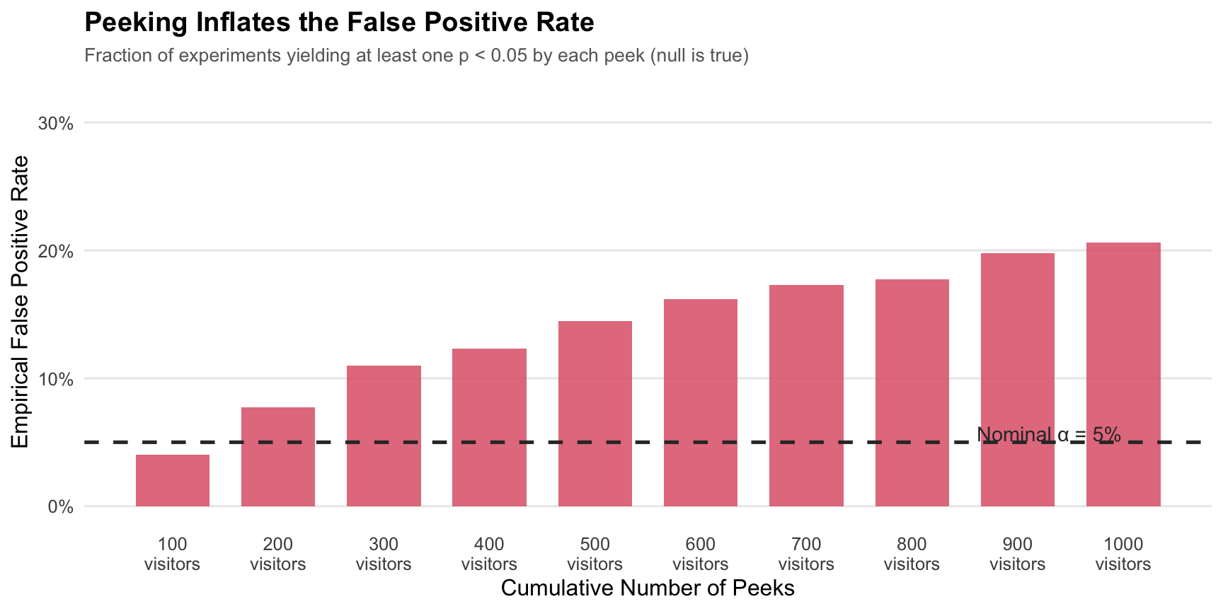
## The Problem with Peeking
So far everything has been straightforward. But here is a tempting shortcut that turns out to be statistically dangerous: **peeking at the results before the experiment is complete**.
### Why Peeking Is Problematic
Suppose your manager checks the p-value after every 100 visitors per group, ready to call a winner the moment any peek crosses $p < 0.05$. The argument sounds reasonable — "if we already have a significant result, why keep running the experiment?"
The problem is that a single test at $\alpha = 0.05$ has a 5% chance of a **false positive** (rejecting $H_0$ when it is actually true). But each additional peek is another roll of the dice. Across 10 sequential peeks, the cumulative probability of getting *at least one* spurious rejection is far higher than 5% — even if there is no true effect at all.
### Simulation
We demonstrate this by simulating experiments under the null ($\pi_A = \pi_B = 0.20$, $\theta = 0$) and recording how often peeking leads to a false positive.
```{r peeking-simulation}
set.seed(123)
pi_null <- 0.20
peek_at <- seq(100, 1000, by = 100)
n_sims  <- 10000

false_positive <- logical(n_sims)

for (i in seq_len(n_sims)) {
  a_obs <- rbinom(1000, 1, pi_null)
  b_obs <- rbinom(1000, 1, pi_null)

  significant_at_any_peek <- any(sapply(peek_at, function(k) {
    a_k  <- a_obs[1:k]
    b_k  <- b_obs[1:k]
    pa   <- mean(a_k)
    pb   <- mean(b_k)
    se_k <- sqrt(pa * (1 - pa) / k + pb * (1 - pb) / k)
    if (se_k == 0) return(FALSE)
    z_k  <- (pa - pb) / se_k
    pval <- 2 * (1 - pnorm(abs(z_k)))
    pval < 0.05
  }))

  false_positive[i] <- significant_at_any_peek
}

fp_rate_peeking <- mean(false_positive)
```
```{r peeking-table, echo=FALSE}
tibble(
Scenario = c("Single test at n = 1,000 (correct)",
"10 sequential peeks (peeking)"),
`False Positive Rate` = c(0.05, fp_rate_peeking),
`Inflation Factor` = c(1.0, fp_rate_peeking / 0.05)
) |>
gt() |>
tab_header(
title = "False Positive Rates: Single Test vs. Peeking",
subtitle = "Simulated under H₀: θ = 0 (10,000 experiments)"
) |>
fmt_percent(columns = `False Positive Rate`, decimals = 1) |>
fmt_number(columns = `Inflation Factor`, decimals = 1) |>
cols_align(align = "center", columns = -Scenario) |>
tab_style(
style = cell_fill(color = "#f8d7da"),
locations = cells_body(rows = 2)
) |>
theme_gt()
```
```{r peeking-viz, echo=FALSE, fig.height=4.5}
# Show how false positive rate grows with each successive peek
# (use a pre-computed approximation to avoid re-running the full simulation)
# We'll compute for a smaller number of sims for the plot
set.seed(456)
n_plot_sims <- 2000
fp_by_peek <- sapply(seq_along(peek_at), function(j) {
peeks_to_check <- peek_at[1:j]
any_sig <- logical(n_plot_sims)
for (i in seq_len(n_plot_sims)) {
a_obs <- rbinom(max(peek_at), 1, pi_null)
b_obs <- rbinom(max(peek_at), 1, pi_null)
any_sig[i] <- any(sapply(peeks_to_check, function(k) {
pa <- mean(a_obs[1:k]); pb <- mean(b_obs[1:k])
se_k <- sqrt(pa*(1-pa)/k + pb*(1-pb)/k)
if (se_k == 0) return(FALSE)
2*(1-pnorm(abs((pa-pb)/se_k))) < 0.05
}))
}
mean(any_sig)
})
tibble(
peeks = seq_along(peek_at),
fp = fp_by_peek
) |>
ggplot(aes(x = peeks, y = fp)) +
geom_col(fill = "#e06377", alpha = 0.85, width = 0.7) +
geom_hline(yintercept = 0.05, color = "#333333",
linetype = "dashed", linewidth = 0.9) +
annotate("text", x = 9.3, y = 0.057,
label = "Nominal α = 5%", size = 3.8, color = "#333333") +
scale_y_continuous(labels = label_percent(accuracy = 1),
limits = c(0, 0.32)) +
scale_x_continuous(breaks = 1:10,
labels = paste0(peek_at, "\nvisitors")) +
labs(
title = "Peeking Inflates the False Positive Rate",
subtitle = "Fraction of experiments yielding at least one p < 0.05 by each peek (null is true)",
x = "Cumulative Number of Peeks",
y = "Empirical False Positive Rate"
) +
theme_minimal(base_size = 12) +
theme(
plot.title = element_text(face = "bold"),
plot.subtitle = element_text(color = "grey40", size = 10),
panel.grid.minor = element_blank(),
panel.grid.major.x = element_blank()
)
```
The empirical false positive rate under peeking (`r scales::percent(fp_rate_peeking, accuracy = 0.1)`) is far above the nominal 5%. Each additional peek compounds the risk: even when *nothing is happening*, the experimenter who peeks repeatedly will eventually see a "significant" result by pure chance.
### What to Do About It
There are several principled responses to this problem:
1. **Pre-register your sample size** and look only once, at the end. This is the classical approach.
2. **Apply a Bonferroni correction** — divide $\alpha$ by the number of tests — which keeps the family-wise error rate at 5% but is conservative.
3. **Use sequential testing methods** (e.g., alpha-spending functions, sequential probability ratio tests) that are designed for repeated looks and maintain the nominal error rate throughout.
The broader lesson: classical frequentist statistics comes with guarantees, but those guarantees only hold when the analysis plan is fixed *before* looking at the data. Peeking violates that contract — and can lead to business decisions based on statistical noise rather than genuine signal.
::: {.callout-warning appearance="simple"}
## Peeking Takeaway
If you test after every interim update and stop at the first significant result, your nominal 5% error rate is no longer 5%. That is not a technical footnote; it changes whether your reported "winner" is actually credible.
:::
## Practical Takeaways
This example shows why A/B testing is more than just comparing two percentages. A good experiment needs random assignment, a clearly defined estimator, a defensible measure of uncertainty, and a commitment not to change the decision rule after looking at the data.
For this simulated homepage test, the evidence points consistently in the same direction: CTA A beats CTA B, the estimated lift is economically meaningful, and the inference is stable across multiple statistical lenses. Just as importantly, the peeking simulation shows how easy it is to break those guarantees if we treat experimentation like a live scoreboard instead of a pre-planned study.
If I were reporting this result to a marketing team, the recommendation would be simple: launch CTA A, document the estimated lift and confidence interval, and keep the experimental protocol fixed for the next test so that the inference remains trustworthy.